-
Kim Dorland
Works / Exhibitions / CV / News
Kim Dorland: Short Documentary
Globe and Mail: Coastal disturbance
NY Arts: Concrete Forest: The Paintings of Kim Dorland
Related link: I Know That I Know Nothing
Westward: Anything goes when it comes to contemporary art at MCA Denver
I <3 Paint 2 at Angell Gallery - A Group Exhibition
I Heart Paint
Painting's Giant Dialogue: An interview with Kim Dorland – Robert Enright, Border Crossings
Report: Canadian Art Highlights at the New York Fairs
Bill Clarke, Canadian Art
From the Upper East Side to the Bowery, Canadian artists and galleries had a strong showing at last week’s art fairs in New York.
Canada’s presence was strongest at the Volta fair with six dealers presenting mainly new works by a single artist. Toronto’s Clint Roenisch featured a series of photographs, sculptures and a charming suite of comedia dell arte-inspired figurative ink drawings by Tony Romano. “The title of the series, Pigro, means ‘lazy’ or ‘an idler,’” explained Roenisch. “So, the drawings depict artists looking for ways to avoid making work.” The booth’s centrepiece was an intriguing composition of vaguely anthropomorphic sculptures titled The Tear at the Party, its titled derived from a droplet-shaped gouge beneath the “eye hole” of the arrangement’s largest piece. (Work by another of Roenisch’s artists, Niall McClelland, was included in the Spring/Break show down in the Bowery; two large kaleidoscopic stain pieces, which he makes using punctured CMYK printer cartridges and heavy Japanese paper, dominated the room in which they were shown.)
Montreal’s Pierre-François Ouellette art contemporain presented work by one of the gallery’s newest artists, John Player, who is currently completing an MFA at Concordia. Nine oil-on-canvas paintings in a range of sizes and a set of nine deft watercolours examined surveillance culture. Several took a drone’s-eye view of the landscape.”It’s as if the surveillance is also being watched,” explained gallery coordinator Edward Maloney. “John sources his images from the Internet in the same way [fellow Canadian] Jon Rafman does, but he then translates the technology back into the traditional medium of paint.”
Upstairs at Volta, Toronto- and New York-based Katharine Mulherin presented a crowd-pleasing series of seven skillfully rendered portraits of dogs (and three cats) by Michael Caines. Referencing 17th-century Dutch portrait painting, the works were displayed against wallpaper featuring landscape scenes, also featuring dogs, drawn by the artist, making the booth feel like a small salon. (Caines’s next show at Mulherin’s Toronto space in May, he says, will feature more felines.)
How women have been traditionally represented by male artists informed two large paintings by Natalie Reis at the booth of Montreal’s Galerie Trois Points. Parasitic Virgin and Odalisque Back Side (both 2008), based on Caravaggio’s Death of the Virgin (c. 1601–6) and Ingres’s Grande Odalisque (1814) respectively, conveyed the feminist undertones that often inform Reis’s work. In her more recent work, such as the large, two-panel Happy Endings (2014), Reis is exploring what she calls “open narratives.” “A phrase like ‘happy endings’ is ambiguous,” she says. “It can be read as a literal happy ending, like in a movie. Or, it might refer to that other ‘happy ending’—the kind a guy might receive at a massage parlour. Meaning depends on the viewer.” (Reis’s current show at the gallery, “Compendium,” runs until March 29.)
For its second year at Volta, Ottawa’s Patrick Mikhail Gallery presented new abstract paintings by Jennifer Lefort, the first extensive showing of her work in the U.S. The gallery also took the opportunity to debut smaller oil-on-canvas works that radiated the same loose and playful energy of the larger paintings. “When you’re showing your work at home, you don’t talk to people about it,” says Lefort. “Everyone knows you, so you talk about other things. But here, people don’t know me, so they want to talk about the work. The conversations have been very motivating, and make me want to rush right back into the studio.” A positive response to Lefort’s work even came from the Wall Street Journal, which featured one of her paintings in its coverage of the fairs.
At the booth of Toronto’s Angell Gallery, viewers were hit with the smell of still-drying paint wafting from the thickly layered surfaces of Kim Dorland‘s paintings. “Kim wanted to make a series of paintings that were more personal than the work produced for his recent McMichael Collection show,” explains gallery manager Joey Chiu. Hanging on the back wall of the gallery’s booth were 18 portraits of the artist’s wife in Dorland’s trademark Fauvist colour palette, a handful of which had been snapped up only one day into the fair.
Other Canadian artists spotted at Volta were Toronto’s Bobby Mathieson and Thrush Holmes, represented by New York galleries Lyons Wier and Mike Weiss, respectively. Mathieson, who shares a similar painterly aesthetic with Dorland, bases his paintings on found images in popular culture that he reworks until they become his own. A brightly coloured riff on Ozzy Osbourne’s Blizzard of Ozz album cover suggests that Mathieson could become a painter to watch. Meanwhile, Holmes conflated ancient Egypt with the early-80s iteration of New York’s new-wave Pyramid dance club, lining the booth’s walls with six large canvases combining spraypainted outlines of figures suggestive of ancient frescoes with neon. An amusing sculpture of a turntable made of neon tubing and a tree stump punctuated the installation.
No Canadian galleries participated in the Armory Show this year; however, Canadian artist Scott Treleaven was featured by New York’s Invisible-Exports in a special section of the fair that focused on notable emerging galleries. An interesting series of untitled mixed media abstractions on paper and board were something of a surprise coming from an artist some know best for figurative photo-based collage; however, upon close looking, collage elements emerge from beneath the layers of paint. Burbling away softly in the middle of the booth was a cool tabletop-scaled sculpture-cum-fountain that referenced Modernist design.
Over at the Scope fair, which took place at the grand, but decommissioned, New York Post Office building, Toronto’s Birch Contemporary was an island of restrained and thoughtfully conceptual work among the sea of graffiti- and street-inspired art and kitschy assemblage. A reconfigured work by Jaan Poldaas, begun in 1978, consisted of a grid of coloured rectangles, with the paint colours mainly found in different aspects of municipal life in Toronto. (These included panels subtitled Blue after AGO, Maroon after TTC, and Red after Toronto Hydro.) A suite of abstract works on paper by the London, UK-based Canadian Shaan Syed, which explore his Islamic background, were hung adjacent. Birch also took the opportunity to debut the gallery’s newest artist, David Hanes. A recent OCAD grad, Hanes presented minimalist but light-filled dye-sublimation prints on polyester fabric. (Hanes’s first show at Birch will take place during the Scotiabank Contact Photography Festival in May.)
Jannick Deslauriers‘s light-as-air hand-sewn sculptures of hand tools—a staple gun, a saw, a wrench—at the booth of Montreal’s Art Mûr were also a welcome sight at Scope. Made from lace and tulle, with stray threads left untrimmed, Deslauriers’s work cleverly usurps traditional notions of what constitutes the feminine versus the masculine. In contrast to these works were two large, dayglo-coloured paintings of architectural forms by Nicolas Grenier that felt utopian and ominous at the same time, and a Pop-inflected sculpture of a rainbow emerging from a black “oil slick” by Patrick Bérubé.
Those needing a break from the bustle of the fairs could visit Sotheby’s hushed Upper East Side galleries and see a fine selection of mid-20th-century Canadian abstraction. The works, which came from private Canadian, American and European collections or from the artists directly, provided a crash-course in the artists affliated with the Automatistes, the Plasticiens and the Painters Eleven. Any pretence that Canadian art is only about landscape painting was immediately stripped away by one of Claude Tousignant‘s large Accélérateur chromatique tondo paintings located at the top of the escalators leading to the exhibition. Highlights included a marvellous baby-blue sculpture by Françoise Sullivan (Untitled,1967), an energetic abstract canvas, Le Huitième Jour (1963) by Charles Gagnon, gem-like paintings by Borduas, Ferron and Molinari from the 1950s, and an enormous Riopelle canvas,Forestine (1954), that possesses a beautifully dark inner glow. “There has been a lot of interest in the work and, yes, works have sold,” said Sotheby’s representative Mark Buck. “But, part of the arrangement with the consignors is that we don’t reveal what did and did not sell.” (Though we did learn that one of the Tousignants was among the works sold.)
FAVOURITE ART EXHIBIT OF 2013: THE MCMICHAEL CANADIAN ART COLLECTION’S YOU ARE HERE: KIM DORLAND AND THE RETURN TO PAINTING – Christina Reynolds, Elle Canada
AF Best in Show and Year in Review 2013 – Oscar Laluyan, Arte Fuse
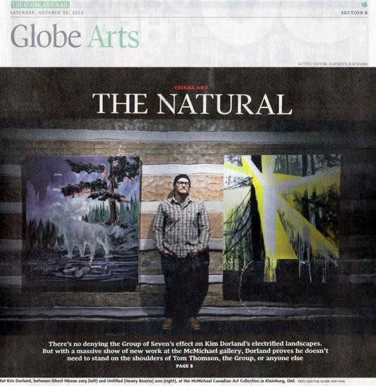
Globe Arts’ Artists of the Year: Kim Dorland, champion of the wild
James Adams, Globe Arts
It takes guts for a contemporary painter to put his work not only in the same gallery as the paintings of Tom Thomson but in the same rooms, often on the same walls where Thomsons are hanging. After all, after almost a century after his mysterious drowning death, Thomson remains, for many, the country’s most beloved, most iconic and, yes, greatest painter.
Not that Kim Dorland, the 39-year-old contemporary painter in question, has any ambitions or intentions to knock Thomson off those perches. He loves Thomson, too, ranks him with Vincent van Gogh, in fact, as his favourite painter of all time. But as he told me a couple of months ago, even though many of his pictures, like Thomson’s, involve gouts of paint, eye-punching colour and outdoor subjects, “I am not Tom Thomson Jr. … And I don’t want the Tom Jr. moniker to follow me around.”
There’s no chance of that happening, as visitors to You Are Here: Kim Dorland and the Return of Painting can attest. That’s the name of the superb exhibition at the McMichael Canadian Art Collection near Toronto where since late October some 90 Dorland paintings, most of them newly created for the show, have been in fruitful conversation with 38 Thomson sketches and canvases along with 12 or so other works by Emily Carr, David Milne and members of the Group of Seven.
The exhibition, the biggest yet for the Alberta-born, Toronto-based artist, affirms his reputation as a virtuoso of the brush, be it sable or air, while the intensity, commitment and utter freshness of the work routs the notion of painting as a retrograde art form for the 21st century. That Dorland and his curator Katerina Atanassova have done this (it runs through Jan. 5, 2014) at the McMichael, the Valhalla of all things Thomson and Group of Seven, seems entirely fitting. Here’s a show that simultaneously brings painting and the McMichael up-to-date while substantiating the possibility that Dorland could become that rara avis in Canadian contemporary art: a commercial, critical and popular success.
Admittedly, there’s nothing terribly consoling about much of Dorland’s art. There’s majesty, certainly, in the show’s indisputable masterpiece, French River, a bravura, eye-consuming triptych, 2.5 metres high, almost six metres wide – but more often than not, Dorland’s natural world is eerie, scary even. It’s a place where, take a wrong path, you could find yourself lost and freezing to death – that or encountering the ghost of Albert Johnson, Mad Trapper of the North, the reincarnated Jason from Friday the 13th or perhaps those weird partiers from Charles Burns’s graphic novel Black Hole, with their vestigial tails, hydra-headed tongues and facial boils.
“Reasonably proficient” in a canoe, Dorland, wife Lori Seymour and sons Thomson, 4, and Seymour, 7, paddled into Algonquin Park’s Canoe Lake, site of Tom Thomson’s demise in July, 1917, this summer. It was “a pretty amazing experience,” at once pilgrimage, research and homage. “There is this sensation of you entering into [Thomson’s] sketches. There was a supernatural charge to the air, definitely.” Yet for all this avidity for the outdoors, Dorland’s a city guy, university-trained, in fact, with a downtown studio and a coterie of dealers here, in New York, Los Angeles and elsewhere. “If you threw me in a canoe, handed me an axe and told me to survive, I’d be dead pretty quickly,” he laughed.
Yet it’s precisely this urban sense of the outdoors – its embrace of the kitschy and the exalted, the pristine and the profaned – that makes Dorland and his art so appealing right here right now. Here’s a guy recognizing, being inspired by and interrogating our ongoing thralldom to Thomson and the Group, someone attuned to tradition yet clearly responsive to the great commands of modernism propounded by, respectively, Ezra Pound and Jean Cocteau: “Make it new;” “Astonish me.”
RUNNERS UP
Seth The Guelph-based cartoonist/illustrator has been doing the covers for Canadian Notes & Queries, a thrice-yearly magazine, since 2010. Each one’s been a beaut, a double-truck of graphic enchantment invoking, more often than not, a Canadian past whose vanishment is made all the more piquant by Seth’s affectionate imagination.
Shary Boyle Music for Silence, Shary Boyle’s mixed-media installation in the Canadian pavilion at the 2103 Venice Biennale, earned mixed reviews upon its opening in June. Nevertheless, an estimated 250,000 visitors were enticed into Boyle’s fantastical grotto by festival close last month. Boyle’s achievement occurred within a constellation of triumphs by other Canadian female artists including Erin Shirreff (winner of the Aimia/AGO Photo Prize) and Colleen Heslin (RBC Painting Competition winner).
Duane Linklater A triumphant year for the multidisciplinary Northern Ontario artist, with a $50,000 win at the Sobey Art Award competition, well-received presentations in Toronto, Thunder Bay, New York and Vancouver and a lengthy stay (until June 15, 2014) at the Art Gallery of Ontario with Modest Livelihood, a mesmerizing silent film collaboration with fellow aboriginal artist/Sobey laureate Brian Jungen.
Kim Dorland Hanging with Tom Thomson at the McMichael
James Adams, The Globe and Mail
Kim Dorland Hanging with Tom Thomson at the McMichael
Kim Dorland was looking quite outdoorsy indoors the other morning. He was wearing a plaid long-sleeved cowboy shirt untucked over a T-shirt and baggy blue jeans, serious-looking leather boots, and a tight black tuque from which protruded unruly thatches of hair. It was a fitting ensemble for the artist whose rising reputation (and fortunes) in the last few years have been based, in many instances, on paintings of forests and lakes, trees and hills, campsites, sky and fauna. Fitting, too, for the location he was in: the McMichael Canadian Art Collection northwest of Toronto, where for decades devotees of Tom Thomson, David Milne, the Group of Seven and other artists besotted by the Great North Woods have made pilgrimages.
Looks, though, can be deceiving. Dorland concedes, at 39, to being a “reasonably proficient” canoeist with a growing interest in the outdoors, but jokes that “if you threw me in a canoe, handed me an axe and told me to survive, I’d be dead pretty quickly.” More seriously, he adds, “I don’t want to position myself as an avid outdoorsman. My identity as an outdoorsman is not part of my practice. My work really is about the perfect psychological moment. Sometimes that moment is in nature. Sometimes it’s in my living room.”
Dorland is having a a major career moment as well. In recent years, the artist has headlined well-received exhibitions at important commercial galleries in New York, Montreal, Milan, Santa Monica and Los Angeles, among other cities. His larger canvasses are now fetching prices in the five figures. And his McMichael show is one of the most anticipated of the fall Canadian-art season. “If we think back four or five years ago, Kim even then was on everyone’s radar and he was there for the loudness of the paint he was using,” says Richard Rhodes, editor of Canadian Art magazine. “But I think if you ask most people now what they’re connecting to, it’s actually his imagery, which seems to have real roots in traditional Canadian landscape content but at the same time has an emotional tenor that makes it feel really immediate and visceral.”
Adds Rhodes: “Does Kim need Tom Thomson? No. He’s already achieved lift-off. He doesn’t need Tom or the Group behind him.”
Dorland is, in fact, a city boy, mostly, with a large studio – he calls it “the lab” – near the intersection of Queen and Dufferin in downtown Toronto, and degrees in fine art from York University and what is now Vancouver’s Emily Carr University of Art + Design. Now, though, he seems on the cusp of a new apotheosis, and it’s coming courtesy of the McMichael, an institution famous more for exalting past glories than deifying contemporary aspirations. Starting this weekend and running through early January, the gallery is presenting close to 90 Dorland paintings – the artist’s biggest public outing to date – under the rubric You Are Here: Kim Dorland and the Return to Painting.
At heart, it’s a solo show, taking up five rooms, but a solo show with a difference: Dorland’s work – notable as ever for its size, superthick impasto, arresting textures, bold composition, narratives both allusive and elusive, and a fluorescently efflorescent palette – is positioned cheek-by-jowl with more than 50 carefully selected painting
s by Thomson, Milne, Carr and four members of the Group of Seven.
The exhibition is the result of an invitation extended to Dorland earlier this year by the McMichael’s chief curator, Katerina Atanassova. Be our artist-in-residence, she told him. Go into our vaults. Look at the art. Wander the grounds. Explore the valley. Visit Thomson and Group of Seven haunts. Then produce a bunch of paintings, et voilà : We’ll create a dialogue between past and present, a refutation of the notion that painting is passé, and a validation of landscape as a fit subject for contemporary art practice.
Roaming the McMichael the other day as preparators hustled to complete the installation of You Are Here, Dorland said he greeted Atanassova’s offer with “a big yeah” – and “reservations.” His admiration for the Group, and especially its muse, Thomson, is well-known. After enduring a tough childhood in east-central Alberta, he left his mother at age 16 to move into the Red Deer home of his girlfriend (now his wife) Lori Seymour, where, as a self-described “going-nowhere teen,” he found himself thumbing enchantedly through a book on Thomson and the Group. “Before I found art,” he writes in one of the panels for You Are Here, “I had no sense of the future. I could have ended up in a dead-end job or even jail, not because I was violent but because I was thoughtless. Then I found this. It is all I wanted.”
Thomson remains Dorland’s favourite painter. His four-year-old son – a brother to seven-year-old Seymour – is even named Thomson. You Are Here includes 38 Thomson sketches and canvases. And one of the artist’s concerns was that the exhibit not be seen as a smackdown or competition – that it be done “with respect … so that it’s not about dismantling anything, or taking a torch to someone or something … that it was about creating a non-confrontational space.”
Another was that the residency itself “accommodate my hermit-like nature. I’m a pretty private person. And because of the nature of my practice, I needed consistent access to my studio, my airbrush, different materials. So the residency wasn’t going to be so much about plein-air painting, although I did do some of that for the show.” Neither would it be about publicizing Dorland’s presence by, say, setting up an easel in the reconstructed Tom Thomson shack on the McMichael grounds and letting visitors watch.
Not, he adds with a chuckle, that there was ever “a danger of me being bullied into anything. I’m a pretty headstrong person with pretty clear ideas.” Besides, “I’m not Tom Thomson Jr. … just because I work with thick paint and do landscapes and I’m a colourist. I don’t,” he says, laughing, “want this Tom Jr. moniker to follow me around” – although Dorland is the first to concede that “audiences have their own minds about these things.”
For the most part, the McMichael experience was at once highly productive – resulting in dozens of sketches and full-scale paintings – and akin to having a deeply coveted wish come true, one that included what Dorland calls a “bucket-list pilgrimage” last summer, with Seymour and their children, to Canoe Lake, the site of Thomson’s untimely and mysterious death in 1917.
“I took it as an opportunity and tried to not to have any fear,” says Dorland of his “big yeah. … I knew there was a way to dive in and make a contemporary art show. I’ve always had a sort of can-do attitude – which is probably the Albertan in me.”
In fact, he soon came to refer to his McMichael residency as “the sabbatical,” marking as it did a welcome break from “the concerns of the commercial art world I exist in. While I’ve been very fortunate and I consider myself very lucky and happy to have the life I have, there are also headaches … and here was this return to pure painting.”
You Are Here is an exciting, powerful show, rich in its many dialogues not only with Dorland’s inspirations but with his own work – work that, by his own admission, has as many debts to, among others, Edward Hopper, Georg Baselitz, Peter Doig, the Friday the 13th movie franchise and Sasquatch stories as it does to the Group of Seven members now buried on the grounds of the McMichael.
One especially effective dialogue occurs in a corner in the exhibition’s penultimate space. It is a three-way conversation involving two Thomsons – one a small but energetic sketch he did of a waterfall in 1916; the other a more substantial oil-on-canvas version of the falls completed the next year – and Dorland’s own large (roughly 2-by-2.5 metres), viscously vibrant riff on the two, titled Woodland Waterfall (After Tom Thomson). The last room features the exhibition’s showstopper: a triptych, 2.5 metres high, almost six metres wide, called French River: He describes the waterway dividing Northern from Southern Ontario as “one of the most mesmerizing, beautiful places I’d ever been to; I took hundreds of Polaroids for the painting.”
Overall, the show affirms what Canadian art critic and scholar Robert Enright calls “Kim’s immense aspiration to be better and to do a lot of work … I know he’s the kind of painter who elicits strong opinions. I know painters who hate his work; I know others who really like it. In that way, he seems decidedly not Canadian because he won’t let you sit on the fence. You have to take a stand on one side of the wall or the other.” Pro or con, quips Rhodes, “What we have here is good programming by the McMichael.”
Just how big Dorland’s latest moment will be remains to be seen. The artist himself isn’t bothering with such speculation. “I just wanted to put a really good painting show together,” he says. “And I hope people like it.”
How Kim Dorland is Changing the Landscape at McMichael Gallery
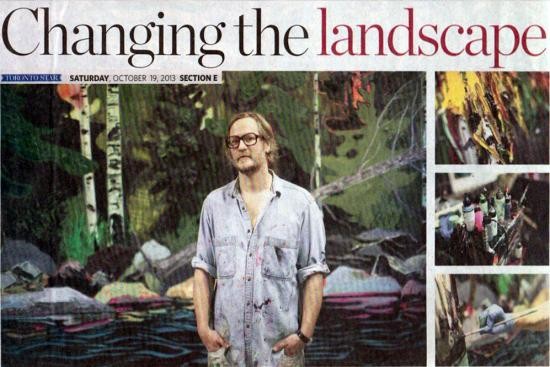
Murray Whyte, The Toronto Star
The Toronto painter grapples with the spectre of Tom Thomson to show that landscape painting has its place in contemporary art.
By: Murray Whyte Visual arts
When the McMichael Canadian Art Collection snared Kim Dorland as the torch-bearer for their all-new artist-in-residence program, the Toronto painter had to lay down some ground rules — like, say, regarding the suggestion he spend a day painting in Tom Thomson’s relocated shack on the gallery’s grounds for the ogling masses.
“Right off the bat, I said ‘no way,’” laughed Dorland. “I mean, as if that would happen. I wasn’t interested in making it this showy thing. I wanted to show that painting, and landscape painting, can be a contemporary practice.”
If that was the intention, then Dorland gets his wish, and in spades. On Oct. 26, all five of the McMichael’s upper galleries will be devoted to Dorland’s thoroughly contemporary take when it opens You Are Here: Kim Dorland and the Return to Painting. The show is the product of four feverish months of painting in the artist’s Dufferin St. studio, along with select works borrowed from collectors here and abroad.
All-in, a solid two-dozen of the artist’s full-sized canvases — six by eight feet is about a standard-sized Dorland; one, a three-panel effort called French River, spans 18 feet in width, and eight tall — will hang in the gallery until January, along with hundreds of photographs, sketches and studies that look to illustrate his process. “It’s to let the viewer into my brain,” he says.
Even with all that, he’s not going it alone: Sprinkled throughout the galleries amid Dorland’s works will be pieces by such mainstays of the McMichael collection as David Milne, Frederick Varley, Emily Carr and, in more-than-prominent fashion, Tom Thomson.
The prospect of going face-to-face with such iconic figures was a worrisome one for Dorland, and for a whole breadth of reasons. The most daunting, perhaps, has been the McMichael’s troublesome history of being seen as a tomb of Canadian historical art left preserved in amber and beyond reproach.
Recent years have seen the museum slowly emerge from the shadow of its founders, Robert and Signe McMichael, whose disdain for contemporary art being shown alongside their beloved collection of Group of Seven paintings landed the gallery in the Supreme Court over Robert’s constant protestations.
Even so, the recovery has been slow, and the gallery still bears up under the weight of expectation, both from an art community that sits eager to dismiss it, and a constituency of members still bound to the gallery’s outdated, patriotic reverence regarding its core collection.
All of which lands Dorland, like it or not, at the crossroads of the McMichael’s path forward. “Should be interesting, that’s for sure,” says Dorland, with a mildly dubious grin. “I think we’re all going in a little bit hopeful, and a little bit nervous.”
As much a risk as the show might be for the gallery, it’s very much a calculated one. Chief curator Katerina Atanassova is as tuned in as any with a recent and ongoing reconsideration of the Group of Seven. You could call it a reclamation effort, to see the Group less as beloved patriotic artistic chestnuts, and more as full-blooded Modernist painters in sync with the early 20th century’s most trenchant aesthetic upheavals.
That point of view got its most prominent airing with the recent exhibitionPainting Canada exhibition, mounted by London’s Dulwich Picture Gallery two years ago, which traveled to the McMichael last fall. Atanassova was a co-curator of the exhibition, and the juxtaposition of the Group with Dorland’s aggressively contemporary take on things is both knowing sacrilege and makes perfect sense.
It will, however, be a challenge for some, namely the aging cohort of McMichael devotees who like their painting served with a cup of tea and an air of reverence. Their discomfort notwithstanding, consider for a moment Dorland’s own. While the show will include works by several of the McMichael’s historical artists, Thomson figures into Dorland’s world as a painter more than any other.
Grappling, in a very public way, with the spectre of Thomson wasn’t a task he took lightly. He named his son after him, for one thing, and counts him as an early influence. “There were lots of others — Georg Baselitz, Peter Doig,” he says. “But Thomson was my first.”
In one room, Dorland pays homage with what he calls “a Thomson shrine,” with several works he painted about the woodsy painter, who died in a mysterious accident on Canoe Lake in 1917, at age 39 (coincidentally, the same age Dorland is now). For the show, he made the trip, surveying the lake that claimed Thomson with equal parts awe and dread. “It was like walking into one of his sketches,” he said. “But there was also this creepy, Shining-esque vibe. It was really humbling.”
He was asked to respond to specific pieces from the collection, and naturally, Thomson looms large. One, French River, the 18-footer, is Dorland’s liberal impression of an enigmatic oil sketch by Thomson, measuring less than 2 feet square. Another, Woodland Waterfall, at six by eight feet, pays homage to Thomson’s four-by-four canvas of the same name.
Scale isn’t the only difference. As a painter, Dorland manipulates surface and texture by astounding degree. Some portions of a single painting are dead-flat, images dusted lightly on canvas by airbrush; others mound up thick clots of paint in a textural snarl that threatens to overwhelm the image itself.
In Woodland Waterfall, the Dorland version, thick, icy strokes of white and blue tumble forth less like liquid and more as static bars of pure colour. “When you’re dealing with only the landscape, you have to tune up the material a lot to push it into an interesting, uncomfortable place,” says Dorland, matter-of-fact. “I always said that if I produce something that’s strictly just beautiful, I failed. My biggest fear is that my paintings go up somewhere and then become inert.”
Looking at this body of work, not to mention the solid decade or so of Dorland’s production, there’s little danger of that. Which, really, isn’t so different from Thomson himself. The winter before his death, Thomson produced what many believe to be his signature masterpiece, The Jack Pine. In it, a scraggly tree drapes in the foreground of a dusky lake scene, the sky built with bricks of colour — yellow and ochre, pale greens and blues.
“That’s a really uncomfortable painting, in a good way,” nods Dorland. And speaking of uncomfortable, there’s a good and a bad. The good, in this show, will be a corridor lined with sketches, Thomson’s on one side, Dorland’s on the other. “It’s not me versus him,” he says. “It’s me saying this guy is amazing and these are the works I did in response.”
As for the bad, Dorland’s been able to rein that in, for the most part. “They wanted to put life-sized sepia-toned photos of Thomson and me side by side, at the entrance,” he says, cringing. “I flat-out refused. I don’t want to be Tom junior. I want to engage with my influences, but do my own thing, too.”
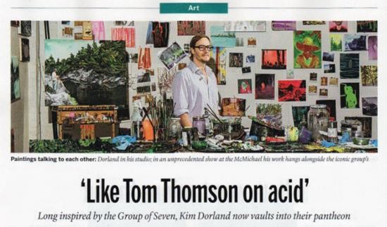
Like Tom Thomson on Acid – Sara Angel, Maclean's Magazine
Is that the forest pressing in, or the Group of Seven?
Sarah Milroy, The Globe and Mail
Is that the forest pressing in, or the Group of Seven?
SARAH MILROY
Special to The Globe and Mail
Published Friday, Apr. 26 2013
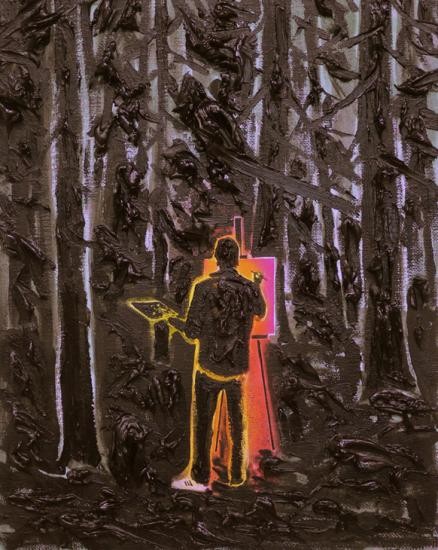
In his Toronto studio this week, the 39-year-old artist Kim Dorland said: “If I am still painting in 40 years, I think this will be one of the paintings that I’ll look back on as being the most important.” The occasion for our meeting was the imminent departure of a fresh crop of his paintings for New York. Less congested than the inches-deep impasto paintings for which he has become well known (“It’s about having the maturity to know when the painting has to stop,” he told me, laughing), the new works continue to explore the landscape, the human figure (in particular, that of his wife and muse, Lori) and the legacy of Canadian historical art.
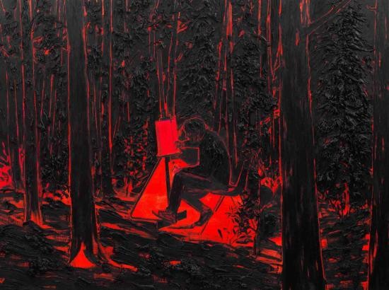
Dripping Dream, which he was alluding to, is indeed quintessential Dorland. Painted a fiery orange-red and streaked with smeared and clotted black, it depicts the artist in the woods at Emma Lake, the site of the legendary artist retreat in Saskatchewan. The painting’s source was a photograph of the artist taken by a friend, and it documents his first attempts there at en plein air painting. Seated at the easel with his legs comfortably crossed, he seems utterly engaged in his art making. “Everything about the pose is built into that single brushstroke,” Dorland said to me, indicating the single downward stroke inscribed on the painting’s canvas-within-a-canvas. “It activates the whole thing.”
Rather than seeming idyllic, though, the scene feels claustrophobic, even nightmarish. All around him, the chaos of nature threatens to press in, as does the weight of cultural memory. Dorland borrows the experimental brushwork of Tom Thomson, the painterly gestures of American abstraction, the David Milne-like use of the under-painting to outline form and the presentation of painting as a civilized pursuit best undertaken in a tweed jacket and brogues, Ã la Group of Seven. Repeatedly, even compulsively, Dorland refers back to that seminal, early-20th-century moment in Canadian art in which the northerly reaches of Ontario were opened up for resource extraction and tourism. One wonders: Is this the forest that bears down upon the subject, or the charged artistic traditions of the past? Dorland puts himself in the hot seat.
Emma Lake, too, is a historically weighty place. For four decades, it was a pivotal point of convergence for Canadian artists and visiting artistic dignitaries from the United States and beyond. (Jules Olitski, Barnett Newman, Kenneth Noland and the critic Clement Greenberg were among the program leaders.) The workshop has now ceased to be; Dorland’s visit in 2009 was one of the last.
“It’s an amazing place,” he said. “If you go for a walk in the forest, you come across easels and chairs that have been just left out in the woods. There are rocks that still have the paint scrapings on them where people cleaned their brushes.” He added: “I think there’s an Anthony Caro sculpture out there somewhere that no one can find.”
Other pictures from his new show continue to tangle with the landscape tradition. A small blue painting of Lori hip-deep in a lake, with her fingertips just grazing the flat surface of the water, is another play on planar composition. The End, a giant forest-scape diffused with dazzling light, suggests the euphorias of Fred Varley or Emily Carr, embodied here in spray paint. A new medium for an old message.
Kim Dorland: Ghosts of You and Me will be on show at Mike Weiss Gallery in New York from May 2 to June 8. At the McMichael Canadian Collection in Kleinberg, Ont., this fall, Dorland will exhibit a survey of his paintings along with historical Canadian works chosen from the museum's collection.
Beautiful Stuff
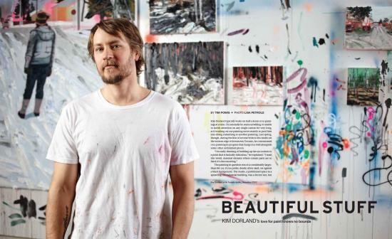
Tim Powis, Canadian Art Magazine
Kim Dorland typically works on half a dozen or so paintings at a time. Occasionally he seems unwilling or unable to lavish attention on any single canvas for very long, as if working on one painting serves mainly to prod him into doing something to another painting. Last spring, though, during the first of several visits to his studio on the western edge of downtown Toronto, he concentrated on a painting in progress that hung on a wall alongside some other unfinished pieces.
“I’m really thinking of building up the eye sockets to a point that is basically ridiculous,” he explained. “I want this weird, material element where certain parts are so thick it’s disconcerting. ”The painting in question was of a considerably larger-than-life (or, if you prefer, death) silver skull, set against a black background. The studio, a partitioned space in a sprawling old industrial building, was a decent size, but it felt cramped. (He has since moved to a more open and better-lit space across the hall.) There were paintings, most ranging in size between pretty big and even bigger, in various stages of completion, everywhere: hanging from walls, leaning on walls, leaning against other paintings, lying face up on horizontal surfaces. A few mounted, taxidermied animal heads lurked about: a rabid-seeming, nail-studded bear strung with bloody-looking strands of painted yarn; an untouched elk; a side-by-side pair of moose heads, one painted, one not, snouts pointed at the ceiling. Dorland’s worktable was (and remains) a picturesque jumble of paint-bearing tubes and bottles, and jars sprouting bouquets of brushes.
“This is the good thing about having paintings that fail,” he said, leaning down to scoop up a roughly spherical blob of paint in his latex-gloved hand. The pan on the floor from which he extracted the blob held an ungainly, multicoloured mound of oil paint, most of it recycled from thickly impastoed pieces that he’d decided, as he often does, to scrap and scrape.
Without fuss or deliberation, he slapped the blob into the skull’s empty black eye socket. The next step—a crucial one in the battle against gravity—was to fasten the protuberant eye blob securely to the canvas.
“This is my trade secret,” said Dorland, grabbing a power drill from the worktable and fitting a screw into its business end. He proceeded to bolt the eye blob into the socket, which took all of a second or two. The head of the screw was visible in the middle of the blob, but Dorland didn’t seem to mind. “I actually like it when the screws show,” he said. “I’ve never really hidden that fact.”
The skull, which was completed a couple of visits later, isn’t just any old skull. It belongs to Tom Thomson—or, rather, it was inspired by the forensically tangled story of Thomson’s skull, as related in Roy MacGregor’s book Northern Light: The Enduring Mystery of Tom Thomson and the Woman Who Loved Him (2010). Dorland has worked on a few paintings of that iconic set of head bones lately. “There’s the famous image of Tom Thomson’s skull that was in the paper when Roy MacGregor’s amazing book came out,” he explains. “It’s just such a beautifully graphic, interesting image, and I love what it says about Canadian history and the myth of Tom Thomson.” Also, Thomson happens to be tied with Van Gogh as Dorland’s favourite painter, dead or alive. “He’s an artist that I admire so much, who I think is heads and tails above his peers,” says Dorland, “and whose work I think about a lot.”
Dorland’s work on the silver-on-black skull painting coincided with the early stages of a very different set of paintings created for his most recent solo show, which appeared last fall at Toronto’s Angell Gallery. Called “I’m An Adult Now,” the 12-piece exhibition took its name from a mid-’80s left-field hit by the Pursuit of Happiness, but the title also signaled an artistic coming of age. “I think it’s the tightest, most restrained, poised show I’ve ever done,” says Dorland. For his part, Jamie Angell, the gallery’s director, says, “My reaction was a sense of pride that the exhibition as a whole could easily have carried itself in an international museum. There was a cohesiveness in how each piece related to the others and told a story.”
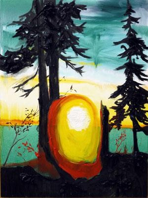
Based mostly on a series of photographs taken one evening in Toronto’s High Park, the show included depictions of Dorland and his family—his wife, Lori Seymour, whom Dorland has painted often, and, for the first time, their two young sons. Most striking was the pervasive redness of the show. That chromatic theme was announced to overwhelming effect by the show’s magnum opus, Red Forest #2 (2012), a large, 2-by-3.5-metre oil painting granted a full room and viewing bench just inside the gallery’s entrance. The piece’s title is both inarguably accurate and woefully inadequate. The forest is indeed red—pulsatingly, brilliantly, almost violently red—taking a subtle turn toward orange as the trees recede into the distance. Fluorescent slivers of greenish-yellow sky are visible through the dense foliage, providing the only respite from red even as they clash with it. There’s plenty of detail in the nearer trees—ridges, knotholes, gnarls, the horizontal, normally black striations in birch bark—but it’s all rendered texturally, through impasto, not through contrasts of colour and shade. Equally imposing is the somewhat smaller Picnic Table (2012), which lorded over the gallery’s main room. A copse of red trees surrounds an actual miniature wooden picnic table (built by Dorland) that juts out from the centre of the canvas. Here, the trees are sparser and the more abundant sky is a pale, dusky pink.
Other ingredients now and then make their way into his art, but more than anything Kim Dorland loves paint. “It’s beautiful stuff,” he says. “It’s inherently beautiful. If I were a photorealist painter I’d have a lot more money, but I’m fascinated by the material and how you can make it work, scrape it and move it, and it always has this blood-clot viscosity. But I’m also paying homage to a lot of my influences.” As one might expect from an artist who’s been known to pile paint up into sculpture-like outcroppings that protrude eight or nine inches beyond the canvas, Dorland leans toward painters who revel in the textural potential and the substance of paint. Off
the top of his head, he mentions Georg Baselitz, Willem de Kooning and “the British guys,” Lucian Freud and Frank Auerbach.
“I remember the first time I saw an Auerbach in person, here in Toronto,” he recalls. “It was just unbelievable to me. I’d never seen anything like it, the way the material looked and felt. It was sort of icky. It was almost too much for me to take. I really loved that experience.”
Though he jokes about being a “dinosaur,” Dorland is not at all ambivalent or apologetic about his chosen medium. He seems sincerely unconcerned about the barrage of death notices painting has endured over the last few decades. “I just never really cared about that argument,” he shrugs. “If painting stayed where it was back when I was at school, it’d certainly be dead. Because basically painting turned into an illustration of theory and it was just totally dead and boring. But even in the digital age I don’t think it can ever die, because sometimes you don’t want a computer screen. You want something handmade.”
Giving form and content to Dorland’s obsession with paint is his insistence on narrative, which tends to be rooted in his own experience. Dorland matter-of-factly describes his hardscrabble upbringing as “white trash.” His mother was only 17 years old when Kim was born in 1974, in Wainwright, Alberta. “I grew up very poor and basically had zero prospects. My mother kicked me out of the house when I was 16. She got a new boyfriend; she thought he would save her life. And then she went totally nuts. I moved in with my girlfriend at the time and she saved me from the path I was on.” Dorland says he hasn’t spoken to his mother for 20 years. (His father, whom he also hadn’t seen for a long time, died four years ago.) The girlfriend, Lori Seymour, is now his wife.
It was around the time when Dorland started dating Seymour that he took up painting. She didn’t specifically encourage him in that direction, but he credits her for giving him the confidence to choose and pursue painting as a career. He earned a BFA at Vancouver’s Emily Carr Institute of Art + Design. (Interesting aside: one of his teachers at Emily Carr was Ian Wallace, the renowned conceptual photographer; despite the apparent mismatch, Dorland describes Wallace as “psychotically smart” and says that “the influence he had on me and my thinking about what I wanted to do has affected me to this day.”) In 2003, Dorland got his MFA at York University, in Toronto. After graduating from York, he still had a lot to learn, mainly about himself. He dabbled in abstraction, realism, various styles. “It was convincing,” he says of the casting-around period, “but inside I felt like it wasn’t what I was after. And then it kind of came to me what I was after: I wanted to tell my own story.”
The watershed work, from Dorland’s own perspective, was The Loner, an acrylic painting from the summer of 2005. It depicts a young, forlorn-looking man standing in the middle ground, facing the viewer, dressed in blue jeans and a chequered jacket. Half of his face and much of his body are obscured by a slightly tilting, leafless tree in the foreground. Behind him is a sparse scattering of young birches, and beyond them a thick, almost abstract forest, the trees little more than vertical streaks of earth-tone paint. Above it all spreads a satanic sky the colour of overripe watermelon. Though it might take you a while to notice (it helps to have Dorland point it out), the man’s right leg is truncated a few inches below the knee—a strange
detail that, judging from the figure’s posture, denotes an amputation more metaphorical than literal. “It was basically a self-portrait of me when I lived in the Prairies,” Dorland explains. “And the scale, the colour relationships, the amount of abstraction—that’s kind of where it all came together. It’s the first painting I painted with fluorescent in the backdrop, which is crazy. The difficulties that raises, I can’t even tell you. There was just something about that painting where I was kind of uncomfortable and wasn’t sure what I thought of it. But the more I sat with it the more I knew that it was the first one. It all worked in that painting.”
Around that time Dorland also began using more paint: layering it on, building it up, and then layering on some more, sometimes squeezing paint straight from the tube onto the canvas. The motivating force was a reaction as much as anything. “Everybody was imitating Gerhard Richter and Luc Tuymans. I adore both of them—I think they’re magnificent painters—but all of a sudden everything was based on the photograph and painting was some kind of response to the photograph and it was photography, photography, photography. I literally just started piling on the paint because I wanted to remind the viewer that they’re not photographs; they’re paintings. It’s really simple, but that was the thought in my head.”
A few years ago, Dorland’s paintings were predominantly images, drawn from his youth, of dead-end suburban life in the Prairies: shabby bungalows, trailer parks, pickup trucks, alleyways lined with graffiti-inscribed garage doors, hapless teenagers loitering under railroad bridges. Then, allowing for some overlap, came the more rustic, Group of Seven–inspired forest scenes. (His work has been displayed at the McMichael Canadian Art Collection, the gallery north of Toronto largely dedicated to the Group of Seven’s art.) Yet the woods Dorland depicts are seldom as pristine or idyllic as those of his forebears: the trees, if they haven’t been logged down to stumps, are likely to be defaced by death-metal graffiti or obscenities. In a big painting called Clearing, from 2009, the sylvan setting is littered with photo spreads torn from a smutty magazine. Something a little unsettling lingers among Dorland’s trees. At times, as in Sasquatch, also from 2009, things get outright scary: holding a dead rabbit and gussied up with bits of real fur, the reclusive forest monster, as rendered by Dorland in its lifesize, super-impastoed glory, looks as if it has just emerged from a radioactive mudbath and forgot to bring a towel.
The tug of war between the tawdry and the transcendent, the drab and the garish, the beautiful and the grotesque, abstraction and figuration- and, in the application of the paint itself, flatness and three-dimensionality—is at the crux of Dorland’s art. “I was really taken with not only the thick impasto and the gestural side of his work, but also the kind of push-pull aesthetic,” says Mike Weiss, whose New York gallery, in Chelsea, has put up two well- received solo shows by Dorland. “I like the way he can get into the psychology of a place, and the way he draws on his experiences and memories. He’s very confrontational. The idea of the bogeyman or the Sasquatch or bikers or people who leave graffiti behind—they become almost folklorish characters. A lot of his work has a magical, nightmarish quality. There’s kind of a kitsch element mixed with this fearful quality.”
That fearfulness was especially evident in a sold-out 2010 exhibition called “New Material,” Dorland’s solo debut at Mike Weiss Gallery. The exhibition’s name was a pun of sorts. On display was new material in the sense of recent work, including an entirely new Sasquatch. But it was also the first time Dorland unveiled taxidermy-based pieces, and it showcased paintings that incorporated other non-paint materials to an unprecedented (for Dorland) degree. “At that point I was definitely interested in adding a sculptural element to the work and seeing how far I could push the surface out,” he says. “I was doing work with screws and fur and glass. There was a piece called Crows (2010) and a lot of the black crows had feathers actually coming out of them, painted.”
The dark tendencies of “New Material” were just as apparent in “Nocturne,” a show mounted in early 2011 at Angell Gallery. “I think he took it that one step further by exploring the woods in the evening,” says Angell. “Some of it was ghoulish; some of it was animals in the woods late at night. There was an image of his wife having an out-of-body experience. It had a fairytale element to it.” In contrast to the often-literal darkness of “New Material” and “Nocturne” (and let’s not forget Tom Thomson’s skull), Dorland brightened up his paintings for “I’m An Adult Now,” though it would be a mistake to equate brightness with cheerfulness. A sense of loneliness and melancholia emanates, for instance, from Him #3 (2012), a depiction of Dorland’s elder son, Seymour, standing silhouetted between the long shadows of two trees. A blazing white sun sets in the upper-right corner of the canvas, suffusing everything in shades of yellow and orangey-red. One reason Dorland had previously been reluctant to paint his children was a concern that sentimentality might gain the upper hand. Presumably, that fear has been laid to rest.
“It’s a weird show. A lot of people have said it’s kind of a depressing show,” Dorland said during a studio visit shortly before the exhibition opened. He was having a mild case of pre-show jitters, feeling a little uncertain about how “I’m An Adult Now”—which turned out to be a success on all fronts—would go over. “I would like to be a more cheerful person,” he added, with a rueful laugh. “It’s not going to happen. I’ve accepted who I am.”
Toronto | Angell Gallery - Kim Dorland
Richard Rhodes, Canadian Art
Toronto painter Kim Dorland is synonymous with big paint. At times, the surface depth of his canvases exceeds four or five inches. The paint is visceral. He works with it like coloured clay, fashioning a sculptural experience as much as a painting experience. Dorland helped put the extreme in extreme painting.
For all this expressive dimensionality, however, he is also a remarkably delicate painter. The usual experience in looking at painting is to see a surface intensify as you look. The paint acquires fluid, tactile presence, the colours gather richness and the image becomes louder, more assertive.
Dorland plays with this framework and does something new with it. He inverts the usual process by speeding it up. At first glance, his paintings are already grossly tactile, intensely coloured and splashily vivid in their imagery. Their in-your-face mode of address is a given, which is why it's a surprising delight to see the paintings actually grow quieter, more subtle and more nuanced as you spend time looking at them. They build room for reflection inside the loudness of their presence. For all their brashness, they savour an expansive quietude that carries from the landscape where many of them are set.
Dorland's latest show revolved around portraits, family groupings and recreational forests, most of them rendered in bright fire-red. The press release for the show talked about "warmth," and the sun images that cut through the forests are something that Dorland gives bodily form with his paint. One of the joys of the show was to see this repeated conflation of paint and image, where Dorland uses bulked-up paint to bring a setting sun through the trees to reside in the literal foreground of a painting. It is a distant image object brought close. In contrast with the vertical compression of the forest space, it reads as an optimistic release, a change of outlook.
Dorland titled his show " I'm An Adult Now" and used it to contextualize paintings that celebrate his family in a reddened space that is not without implications of danger alongside the visions of warmth. The words are a touching recognition of responsibility spoken through paintings that show a rich intersection of paint and image, an intersection that conveys an intense and lively communion of body and mind.
The portrait Wading in (2012) stands apart from the other paintings in its flatness. With a few expert licks of red, Dorland shows himself wading out into water, alone and looking down. In the context of the other pictures, it makes you want him to turn around and come back in.
Fresh and for sale: contemporary art auction focuses on works from 1980 to now
Melissa Leong, The National Post
A sign beside the Kim Dorland painting reads in bold letters: “Please do not touch.”
That’s because the thick, bulbous strokes of oil paint on the canvas entitled Northern Light, Saskatchewan, are still soft, still wet.
The Toronto-based artist finished the work just two weeks ago especially for Concrete Contemporary Auctions and Projects’ inaugural auction, the first of its kind in Canada. You can’t get more contemporary than that.
“I went and picked it up at the Angell Gallery and very gingerly transported it here in the back of my station wagon in a crate,” says Stephen Ranger, vice-president of business development at Waddington’s and founder of Concrete. “That’s fresh.”
Concrete, a division of Waddington’s that Ranger formed last year, will auction 69 works March 8, all of which were created after 1980.
“I looked around the world and saw a thriving market for contemporary work at auction and I didn’t see it happening here,” he says.
Ranger referenced the supreme example of Damien Hirst; the 46-year-old British artist’s 2008 collection at Sotheby’s in London sold for nearly US$200-million. In recent years, Canadian auction houses, too, have begun dividing the sale of fine art and post-war and contemporary works. But Ranger laments that most of the attention is paid to famed pieces by the Group of Seven while contemporary works get short shrift.
“Contemporary work has to be shown and talked about in a contemporary context and not in the context of modern,” he says. “I don’t wish to own a third-rate Group of Seven but that’s all I’d be able to afford to buy. But I can go and buy a Jay Isaac or a Micah Lexier, which have more resonance for me.
“With the growing overall trends in design over the years, the prevailing aesthetic now is modern, it’s contemporary. People don’t collect antiques like they used to, they don’t collect art like they used to.”
This under-served market, he says, needs to be nurtured. Concrete has thus set up an acquisition fund to encourage public institutions to purchase contemporary art. Concrete will match 50% of the purchase price of a work for up to $10,000. Seneca College put in a winning proposal to receive funding for the upcoming auction.
The auction in Toronto is a prime opportunity for younger collectors, Ranger says. He points the Post to a few highlights:
Ian Wallace, Untitled, estimated price $60,000 – $80,000: The Vancouver-based artist created this 2010 work for The Power Plant Contemporary Art Gallery in Toronto. The gallery has consigned it to Concrete. The photolaminate with acrylic on canvas features an installer at The Power Plant preparing a show. “This piece is very typical of his work. What is interesting is not only the layers of meaning he is constructing but it’s also beautiful to look at.”
Ken Lum, A Tale of Two Children: A Work for Strathcona, estimated price $6,000 – $8,000: The Vancouver-based conceptual artist takes on the subjects of parenting and culture in this 2005 work which was originally a billboard-sized public art piece. “This is art that makes you think. It’s a comment on our society, on the way we praise or denigrate our kids. It takes on stereotypes. It’s also graphically powerful.”
Philip Iverson, Self Portrait, estimated price $12,000-$18,000: Iverson, an abstract and expressionist painter born in Fredericton, died in 2006 at the age of 41. “This is a masterful painting. If you look at these colours, there’s almost a van Gogh quality to them. It’s bright, vivid, strong and sad – it just encompasses a range of human experience.”
For more information, visit waddingtons.ca.
Standing Nude sells for $19,200 in ‘contemporary’ Canadian art auction
James Adams, The Globe and Mail
The staples of the Canadian fine art resale market are things like Homer Watson’s pictures of contented cows in an Ontario barnyard, Fred Coburn scenes of horses pulling logs through a wintry landscape, the monumental abstract canvasses of Jean-Paul Riopelle.
None of these standbys, however, were for sale Thursday evening in Toronto as Concrete Contemporary Auctions and Projects, a newly formed division of venerable Waddington’s auctioneers, hosted what it billed as “the first truly contemporary auction of Canadian art ever held for commercial purposes.”
All 69 lots up for bidding, carrying a total pre-sale estimate of $407,500 to $564,400, dated from the mid-1980s onwards and most were by artists who are still alive and, for the most part, continue to produce new art. Expectations, though, were modest as sales of contemporary Canadian art at auction, while growing, remain very much in the shadow of veteran (and dead) performers like the Group of Seven, Riopelle and Emily Carr.
And so it came to pass Thursday before a crowd of about 90. Although Canadian artists like Iain Baxter&, Lynne Cohen, Micah Lexier, David Urban, Ric Evans and Cathy Daley certainly appeal to with-it primary-market collectors, art museums and art fairs, it was made clear by the Concrete auction that, at the resale level, they remain very much an acquired taste.
Concrete founder and Waddington vice-president of business development Stephen Ranger didn’t have hard figures either for lots sold or cash value by sale’s end. But he estimated that “we sold probably 60 per cent” – an optimistic tally in that some calculated the sell-through to be more like 49 to 55 per cent. Still, as Ranger himself remarked, “you gotta start somewhere . . . I think we put together a great sale . . . and what we did sell sold very well.”
The single biggest earner was Standing Nude, a full-frontal female figure study, done in tempera on wood panel by Kitchener’s Jeremy Smith. It went into the bidding with a $10,000-$15,000 estimate and sold for $19,200 (including 20 per cent buyer’s premium). Also doing well was Ottawan Carol Wainio’s creamy, dreamy acrylic-on-linen, Structures of Memory, selling for $16,800 (including premium), almost three times its high-end estimate of $6,000. Northern Light, Saskatchewan, a bold landscape by Alberta-born, Toronto-based Kim Dorland, sold for $15,600 (including premium) against an estimate of $10,000-$15,000.
Meanwhile, Crowd 2004, a linocut print by Torontonian Stephen Andrews, fetched $8,500 – just a notch below its low-end estimate of $9,000 but enough to go into Concrete’s history books as the first successful transaction in the Concrete Contemporary Acquisition Fund. The fund’s designed to help public institutions buy art from Concrete, with the auctioneer agreeing to pay up to 50 per cent of the purchase price of an auctioned work, to a maximum of $10,000. In this case, Toronto’s Seneca College Art Collection was the beneficiary.
Nonetheless, there were disappointments aplenty, most notably Ian Wallace’s Untitled (The Power Plant Painter) which had the highest estimate of all the lots ($60,000-$80,000) yet failed to sell when bidding failed to move beyond $50,000. Wallace had donated the photolaminate with acrylic on canvas as a fundraiser to benefit Toronto’s non-profit Power Plant gallery. Another West Coast conceptualist, Ken Lum, also struck out, failing to see two of his digital prints find a home. Also unsold were two sets of numbers, And Still Counting, on plywood by Haligonian conceptualist Garry Neill Kennedy. These too had been donated on the understanding that proceeds would go to a non-profit, in this case Halifax’s Khyber Arts Society.
Kim Dorland
James D. Campbell, Magenta
Walking into Kim Dorland’s Enter, Light at the Division space, and smelling the thick, pungent, heady and altogether sensuous materiality of the paintings there, reminded me of that sublime cinematic moment when Anthony Hopkins, as Hannibal Lecter, channels Marcus Aurelius in The Silence of the Lambs (1991) and instructs Jodie Foster’s FBI agent Clarice Starling : “Of each thing, ask: what is it, in and of itself. What is its nature?". Well, if it is painting perp Kim Dorland and not serial killer Buffalo Bill who is being analysed here, one might well say: his paint.
It is all there, after all, in the paint – in the sheer physicality of Dorand’s pigment. The more specific and pressing olfactory memory of mine is that of attending Milton Resnick’s NYC shows, where you were still on the sidewalk or in the lobby, and yet you sniffed the oil paint – like narcotic glue – from the still-wet paintings, wafting down from far upstairs like some heaven-sent perfume or divine aromatherapy, promising paintings decalitre-deep in their own fulsome materiality.
Of course, Dorland’s incandescent collision of Canadian history painting and Zombieland leads us to ask one question above all: what does he covet? As Lecter observes in the film: “He covets. That is his nature. And how do we begin to covet, Clarice? Do we seek out things to covet? We begin by coveting what we see every day. Don't you feel eyes moving over your body, Clarice? And don't your eyes seek out the things you want?”
Well, firstly, of course, Dorland covets his thick-bodied paint, unavoidably copious and almost flesh-like in its mien. Those fabulously excrescent painting humps are terrifically seductive and impossible to dismiss. The painter shows his affinities with LA-based Alison Schulnik (who also recently showed at Division), avatars Milton Resnick and Eugene Leroy and, not least, Summer Wheat, that Southern-born, Brooklyn-based, knee-deep-in-her-paint savant.
If Tom Thompson went on a wild romp with Lawren Harris, a true-blue midnight ramble through the suburbia of these paintings, I am quite sure they would deliriously approve and high-five Dorland for sheer tenacity, bloody-mindedness and acknowledge him as blood-kindred. Why? When the sun rises here, the paint melts into a dew that trips us up, nose, foot and optic – and reminds us of ecstatic phenomena otherwise beyond our ken.
Like all good schoolchildren, we know the Thomson myth – seasoned outdoorsman who introduced his erstwhile comrades to Algonquin Park and then died mysteriously, found floating in Canoe Lake just before his 40th birthday in 1917. Well, his dead body is suspended just below the coagulant surfaces of Dorland’s paintings like a talismanic Bogman. I mean, a Bog body, one of the naturally preserved human corpses found in the sphagnum bogs in Northern Europe. Those bog bodies still possess their skin and internal organs due to highly acidic water, low temperature, and a lack of oxygen, and remind us of the beings – zombies and animals both – that Dorland preserves in his copious and seductive acreage of pure pigment just above or below the ground plane of representation.
Arguably, Dorland conflates two or more radiant signifiers of Thomson’s oeuvre – The Jack Pine, a lone pine tree sentinel at the edge of a lonely lake, and The West Wind, a work the sheer turbulence of which reminds us of Dorland’s loving surfeit of anfractuous materiality.
When the sun comes up, as in the resplendent Untitled (Thick Light), Dorland seems to be telling us that he is multitasking: paying homage to Riopelle while acknowledging Harris’s aggressive luminosity and channelling John Legend’s song:
“Baby when the sun comes up, I'm gonna be holding you
It's destiny that your next to me, I'm in love with you
Oh and baby when I wake up, I'm gonna be there with you, a new day rise
I wanna look in your eyes when the sun comes up.”
Bright Show Sure Cure for Winter Blahs
Michael H. Hodges, The Detroit News
If you feel elated the minute you step into "Idealizing the Imaginary," the new exhibit at the Oakland University Art Gallery, you're probably not alone. This 14-person group show running through April 1 is a radiant knockout, and a sure cure for winter doldrums. If these enormous canvases with their brightly colored abstractions don't cheer you up, well, sterner medicine may be called for.
Dick Goody, the gallery's British director, scoured New York galleries to pull together works by 14 artists who've never before shown in Michigan.
"Galleries and artists both were excited to show here," Goody says. "They're enchanted by Detroit. They've been reading."
The result is lush, monumental, and as absorbing as a sun-drenched day at the beach. Indeed, Goody says what he particularly likes is that the works here are "all about spectacle — and so much contemporary art just isn't."
Take New Yorker Katherine Bernhardt's "Blood Orange Juice," a crudely rendered portrait of a female nude that looks like it was knocked off in five minutes — albeit with admirable control and power. Goody calls Bernhardt's technique "laid-back, slapdash, direct and expressionistic."
Indeed, if "Blood Orange" looks childish (a charge, of course, once leveled against Picasso), rest assured no child could convey the frightened skepticism in the woman's eyes, or the work's sense of menace.
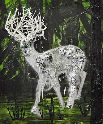
Completely un-menacing and other-worldly is Toronto artist Kim Dorland's "Ghost (Deer)." Here the silver silhouette of a deer is set against a black and emerald background. But bits of the animal — Goody suggests it's ghostly ectoplasm — are sculpted in 3-D, looking like wads of aluminum foil dusted in silver glitter and pasted to the canvas. "Talk about 'no rules anymore,'" says Goody with a little regret. "When I was in art school, we weren't allowed to use glitter."
The work packs real urgency, yet marvelously, the overall impression it leaves is one of exquisite, mystifying beauty.
Also worth close study are Dasha Shishkin's "If Less Is More, Nothing Is Everything" and her erotic, lackadaisical "I Don't Want Any Problems, None Whatsoever." The latter features a contemplative female nude, the tip of one index finger idly parked in her belly button.
A Russian-born artist living in New York, Shishkin approaches her work with more nonchalance than most artists. The two paintings, neither of which is stretched onto a frame — they're just tacked onto the wall — arrived in a box, folded like ordinary tablecloths.
And finally, see if you can't get lost in Cecily Brown's two pieces — particularly the amusingly titled, "Why Are There People Like Frank in the World?" This complicated eruption of colorful daubs generates a mesmerizing sense of three dimensionality. Lean close, and you almost feel you could fall right in.
Don't try. You just might.
Painting Through Your Obsession About Love
Allison Meier, Hyperallergic
Kim Dorland’s paintings do not shy away from the brutality of love. Seizing on all of love’s untamed wildness, Dorland’s portraits of his wife are destructively passionate. Globs of oil paint are heavily dragged and slashed into works that seem made on pure impulse.
When I was first confronted with Kim Dorland’s solo show For Lori at Mike Weiss Gallery in Chelsea, I was overwhelmed with the aggression of the paintings, the way that every brush stroke or paint smear looked lacerated. Boils of paint, defying gravity by cracking off onto the floor, have the mutilated texture of something that’s been set on fire. The human form is not carefully studied, but attacked out of the paint. I was shocked that works so savage were apparently of someone the artist loved, but as I spent more time with them I realized the passion in this was a lover’s obsession.
There’s a Rimbaud poem, “Aube,” where the author is chasing after dawn, who is a woman and phenomenon of nature at the same time, fleeting and wild. I was reminded of the poem while examining the three huge portraits in the back room of the gallery (“Coy Girl,” “Silly Smile” and “For Matisse”) that serve as the show’s anchor.
Like every work in the exhibit, they are portraits of Dorland’s wife Lori Seymour. Yet they are more portraits of a memory than portraits from memory. As if coming out of a dream of her and wanting to capture her fleeing image, Dorland has made flashed impressions of her nude body posed in a flat green landscape. Like Rimbaud running after the dawn, these three portraits are grasping onto something untamed and in the seemingly random drips and pulls of color tangled with nature, Dorland has found Lori. I’ve never seen the raw, real, imperfect love of a relationship so openly painted.
Alongside these three portraits is a much more serene, and more recent, equally sized “Untitled” painting where Lori is reclining on a grass with yellow flowers. Unlike in the other three portraits in the room, her limbs are carefully formed, her skin realistically shaded. However, even here there is a raging pull of paint scratching diagonally, as if Dorland reached a point where he couldn’t contain himself anymore as he imagined his lover’s body.
This is the Canadian artist’s second solo show at Mike Weiss Gallery, the first being New Material in 2010. That exhibit was more fixated on phantasmagoria, with skulls and growling animals lurking in dark forests, and a few taxidermy animals splattered in paint. Creeps of that come into For Lori, even beyond its animalistic desire. In the front of the gallery are darker portraits, where suggestions of faces appear like skulls on paper with ripped edges. The dominating work is “Stargazing,” where a neon Lori is looking up to a night sky made of pasted on gems and a childish shooting star trailing glitter.
In an interview the gallery provided between Dorland and his muse, he responds to her question of why he paints her so much by saying, “I paint you because I adore you.” And while the show is definitely “for Lori,” an incredibly personal shrine to her image, there’s an enticement about it that anyone who’s ever been a bit obsessive about love can get absorbed by.
Kim Dorland: For Lori is at the Mike Weiss Gallery (524 W. 24th Street) from June 23 to August 27, 2011.
Night Dreams
Evanna Folkenfolk, The Newspaper
Light and darkness in Dorland’s ‘Nocturne’
In the chilly whiteness of Angell Gallery on Ossington, and in contrast to its stark featureless walls, the artist Kim Dorland exhibits his latest collection of paintings fittingly named ‘Nocturne.’ Hanging beneath bright fluorescent lights, Dorland’s paintings appear dark and menacing, drawing light inward and echoing it in ominous glow. Ghouls and ghosts flutter across his canvases, peering from behind heavy layers of texturized paint, amid dark forests found only in the most frightening of childhood dreams.
But Dorland’s creations are as beautiful as they are revolting, tender and haunting, like the characters of a Burtonian fairytale, too infused with love and sense to be truly terrifying. Escaping their habitual realm of bedtime stories and campfire tales, Dorland’s creatures stand out in the decidedly adult gallery and its pristine white walls. They have at once both youthful rebellion and innate wisdom, amusement and gravity alike swaying upon their canvases. Their presence is a reminder that we have not changed so very much since childhood.
When asked what he believes to be the role of art in our lives, Dorland argues its function is to transport us from the utter dreariness of our daily lives, to help us escape the seemingly endless grind of routines and obligations. His answer intimates a transformation, or rather subsumption, of our childhood fears which nonetheless exist as a part of our consciousness, a part of the way in which we wake and live and give in to sleep again.
The fear of ghouls and golems has since been replaced by mature fears that are both less definable and infinitely more real; fear of the faceless unknown, the worries that plague us and serve as the foundation of existential crises that have spiraled modern society into unprecedented rates of anxiety and depression.
Through his paintings, Dorland personifies these fears into their child-like counterparts, lighting them up with the dreaminess of childhood. Through his morbid imaginary creatures, he invokes both the innocence of initial waking moments where reality has not dug its claws, as well as the sheer and unadulterated terror with which children react to the unknown. His use of dark and liquid mirror paint, which produces a fluorescent-like glow to his canvases, bolsters this effect of supernatural divinity.
In this manner, Dorland wills his paintings to speak to us, to reflect light back to us, our own images distorted through his dark fearful colors and warped uncanny creations. It is fitting that the inspiration for the first painting of the series, and of ‘Nocturne’ itself, was a dream his wife had of being trapped inside one of Dorland’s canvases, in a dark gloomy forest that slowly began to consume and erase her.
This effect is continually found in his paintings, whose dark coiled tree branches fill the canvas and reach out to the viewer with the magic sway of fairytales, begging us in, our fears at least for a fleeting moment replaced as we lose ourselves in mazes of coiling branches and twisted figures.
Dorland’s art is transcendent, as he believes art to be; it both displays and dispels, putrefying and beautifying his subjects, and making his art into revelation, catharsis, and solution. His dark room, employing abundant amounts of liquid mirror paint, is saved for last as a cherry on top of the mystical sundae, its effects so indescribable, they are best seen with one’s own eyes.
As those present at the exhibit’s opening mingled and collided before paintings that seemed as private as the fuzzy outlines of memories we cling to when we wake, the owner of Angell Gallery, Jamie Angell himself, shared a friend’s reaction to the exhibit: “The paintings taught me things about myself I didn’t even know.”
Kim Dorland’s ‘Nocturne’ is running from January 22 – February 19, 6-9pm at the Angell Gallery, 12 Ossington Avenue.
Related link: Kim Dorland – Nocturne
A Tom Thomson for Today
Sara Angel, Eye Weekly
This past summer, Kim Dorland—one of Canada’s most talented and successful young artists—received the provocative sobriquet “extreme painter.”
The title was bestowed upon Dorland by his Montreal dealer, René Blouin, who was making an analogy to extreme sports. To draw attention to an artistic style emerging in cities including New York, Berlin, and Toronto, Blouin organized a Montreal festival, held at several galleries last July and August, to showcase the work of Dorland and other artists who pile paint on canvas with such bold physicality that their finished works give off an aura of aggression, heat and even violence.
According to Blouin, the extreme painting movement is a rebellion against dominant contemporary tastes that favour cerebral and often confounding works of new media “done under the influence of Photoshop”—in particular, photography and video art.
Dorland does indeed paint with intense and confident brushstrokes, but he has distanced himself from the school of extreme painting. In a recent Maclean’s interview, he explained that he doesn’t see himself as part of a movement in a traditional sense. With “Nocturne,” Dorland’s newly opened exhibition at the Angell Gallery, he proves his point.
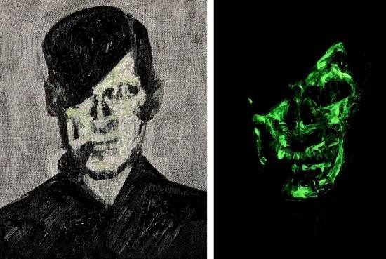
In the gallery’s front window, Dorland has placed 100 copies of a single image set in a tight grid, much like Andy Warhol’s famous Campbell’s soup can silkscreened prints. The picture is a well-known black-and-white photograph of a bow-tied Tom Thomson, Canada’s legendary painter.
On his face, Dorland has modified the original image by superimposing a graffiti–inspired, fluorescent green skull, to haunting effect. This work of art, made on an iPad, flies in the face of extreme painting’s characterization as an anti-digital movement. It also gets to the heart of Dorland’s show and his painting lineage, which he identified as going back to Tom Thomson and “carrying the torch a little bit further.”
“Nocturne” is an homage to Thomson, the Owen Sound–born Group of Seven associate who radically transformed the notion of Canadian landscape painting between 1912—when he first visited Algonquin Park—and 1917, when he drowned mysteriously while paddling on Canoe Lake. Included in Dorland’s exhibition are several paintings of Thomson and various skulls; these are references to an event in 1956, when four men—after a few drinks too many—exhumed a skeleton believed by some to be that of Thomson. A hole found in the skull’s left temple fuelled rumours that the painter had been the subject of foul play, while heightening his iconic status.
Like Thomson, whose painting technique was radical for his day, Dorland pushes the limits of his medium. His artworks in “Nocturne” include depictions of rabbits, owls, trees and dark silhouetted figures; within layers of oil and acrylic paint they incorporate such elements as fur, feather, wood, glitter, strings, screws and glow-in-the-dark pigments. Dorland’s choice of materials gives his audience a heightened boreal experience—like a walk in moonlit woods, these works have the power to simultaneously enchant and startle, terrify and beguile. They delve deep into the national psyche and offer an invigorating new take on what it means to both live and paint in Canada today.
KIM DORLAND
Born: 1974, Wainwright, Alberta
Raised in: Red Deer, Alberta
Lives and works in: Toronto
Education: MFA, York University (2003); BFA, Emily Carr Institute of Art and Design (1998)
Audience outside Canada: Dorland shows in New York at the Mike Weiss Gallery, Los Angeles at the Mark Moore Gallery and in Milan at Bonelli Arte Contemporanea
Known for: both his suburban and wooded landscapes, taking risks by not repeating himself, and piling it on with paint
How others describe him: “This guy is a bad ass!”—Mike Weiss (Dorland’s New York dealer)
Big breakout moment: the 2006 Scope Miami art show when international collectors, curators and galleries took an interest in his work
Key collectors include: Bank of Montreal; The Neumann Family Collection, New York; The Sander Collection, Berlin
Market value: Dorland’s landscapes sell for as much as $48,000, though his smaller works on paper can be bought for $2,000
Related link: Kim Dorland – Nocturne
Spooky Dorland - New Paintings go to the Darker Side
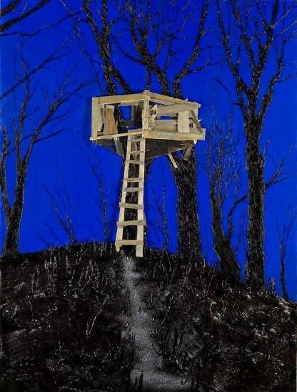
David Jager, NOW Magazine
It’s been four years since Kim Dorland won the RBC Canadian Painting Competition for his brutally thick impasto landscapes that drew heavily on his rural Alberta youth.
Dorland’s new work at Angell is even darker and has taken a distinctively psychological turn. The searing oranges and pinks have given way to thick blacks, greys and pale phosphorescent greens. His gritty rural adolescent vibe has morphed into more ooky-spooky fare in a midnight forest furtively alive with spectral creatures, skeletal trees and shadowy forms.
In the show’s central painting, The Girl Disappears, a female figure, floating between two ghostly trees and dissolving into phosphorescent blobs, radiates a palpable, low-budget-horror unease without being exactly clear: is this an epiphany or a horrible supernatural death?
The eeriness continues in a room of glow-in-the-dark paintings, Dorland’s earnest bid to make work that can be viewed in two different kinds of light. The results are mixed, though Tree, a knotted trunk against a glowing sky, shows that he still has solid drawing instincts. His untitled skeletal drawing of a girl, in which he seems to be channeling morbid existential angst directly from Edvard Munch, is also truer to his tough painterly form.
He’s also laughing through some of it. His antagonistic relationship to traditional Canadian landscape painting resurfaces in the tongue-in-cheek figure of Tom Thomson leering as a ghoul and a decayed skull in three paintings, appearing to be one more ghost in a growing collection of spectres Dorland wants to exorcise.
Yet his most successful work still takes place in something closer to daylight. Tree House, with its stunning cobalt blue sky, is the strongest painting in the show and the one least preoccupied with things that go bump in the mind’s dark forest.
Related link: Kim Dorland – Nocturne
Too Toronto-centric? I have no problem with that.
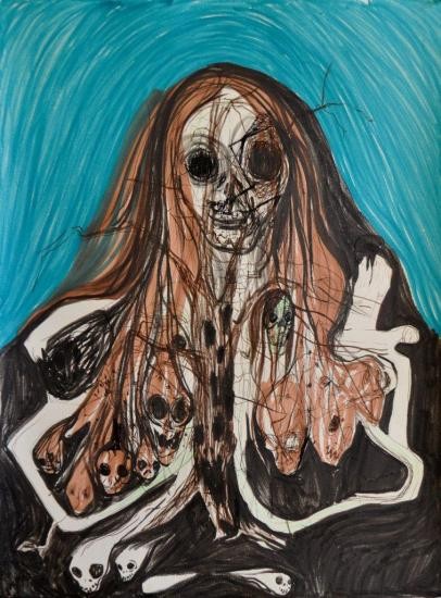
R.M. Vaughan, Globe and Mail
Kim Dorland at Angell Gallery
Jan. 22 to Feb. 19, 12 Ossington Ave., www.angellgallery.com
Local mad genius Kim Dorland is back with a new series of crashing, banging, booming, screeching, and possibly feather and glitter dappled paintings.
Lately, Dorland\'s stretching (via a Jaws Of Life-like, raw and ripping style) of the boundaries of good taste (whatever that is) have made some of his dearest fans wonder what on earth he\'s up to – witness the deliciously baffled, controversial reaction to his new works at the 2010 Art Toronto fair.
But one thing is always certain with Dorland: He aims to please. All that aggression, all that rough, unmixed paint, all those applied-with-a-hammer gobs of oil (not to mention the thumbed-on bits of glass, string, and helpful screws) are there not to elicit shock, or revulsion (although his hot bile colour combos may argue otherwise), but to give the viewer a full, and full-bodied, sensual experience. If you don\'t walk away from a Dorland show rubbing your eyes, you must be wearing Yoko Ono-style wraparounds. Better lurid than lulling.
Related link: Kim Dorland – Nocturne
Shack in the Woods
Natalie Hegert, ARTSlant
It happens when they least expect it, and when we, watching, have come to expect it the most. A group of teenagers enters a wilderness of some sort, far from supervision, and far from safety. Amped on hormones, liquor and laughter they engage in licentious behavior; they separate, coupling. That’s when the monster strikes—enraged by their behavior, he targets and kills each young person, one after the other, in successively horrifying ways. Usually only one survives to tell the tale.
It’s a common fable that we’ve come to know as the modern horror film, warning of the dangers of the wilderness both physical and metaphysical. It's this landscape, at turns inviting and terrifying, that Kim Dorland depicts in his new show at Mike Weiss gallery. His paintings explore those liminal spaces of the wilderness, a place free of the constrictions of adult civilization. But along with that freedom comes the ever-present possibility of a hockey-masked freak coming to slice your neck. Jason is there, and so is Jack (Nicholson?), the familiar Boogeyman as well as the Canadian-native cryptic lake monster, the Ogopogo, all depicted, rather touchingly, in somewhat humanizing portraits.
Dorland’s enormous canvases, piled with and positively gushing with paint, explore the borderlands between civilization and wilderness. Not deep wilderness, but wild areas easily reached by suburban teens seeking a refuge from the watchful eye of authority. You know the spots—landmarks riddled with the evidence of late-night drinking sessions and adolescent graffiti, places invariably christened with names like “the Drinking Shack” or “Party Rock.” The centerpiece of the show perhaps is Shack, an enormous mixed-media painting, bordering on sculpture, built out with screws and wooden slats to form an actual shack, marked with the warning “KEEP THE FUCK OUT!”
Signs of adolescent rebellion carved in trees, heavy metal and punk band names, sexual fascination and frustration expressed with rude, crude drawings. It’s the kind of puerile pollution of the natural that Dorland engages with in pieces like Caribou Sculpture—a taxidermied caribou head marred with paint irreverently splattered over the animal’s eye and dripping from his antlers, antlers which have been tagged all over with juvenile graffiti like, “Easy Sleazy,” “TITS,” and “Got Beer?” It’s a challenging piece. It immediately reads as a defilement of majestic nature, but it’s somewhere between a critical and a celebratory stance, representing Dorland’s complex relationshipwith nature and expressing those pivotal moments of hormonal-driven exploration and discovery.
Taxidermy Animals Dipped in Paint and Sprinkled in Glitter? Yes, See This Exhibit
Genevieve Bahrenburg, ELLE
This weekend, Mike Weiss Gallery is presenting New Material, artist Kim Dorland’s first solo exhibition with the gallery. Comprised of watercolors, assemblage on paper and taxidermy animals like a paint splattered caribou head (left), New Material visually articulates Dorland’s upbringing in rural Canada (clearly, Dorland’s childhood wasn’t exactly run-of-the-mill).
In both the Caribou sculpture and Ghost (Deer), you can see that Dorland had a complex relationship with the Canadian woods when he was a boy.
His taxidermy figures are dipped in paint and sprinkled in glitter which diffuses any predatory quality that these animals might otherwise have had. Consequently, Dorland ‘s work simultaneously intimidates and lures viewers his fantastical, nightmarish forest.
Here, gallery owner Mike Weiss talks about why he digs Dorland.
ELLE.com: What did you find so compelling about Dorland that you decided to grant him his first solo exhibition at your gallery?
MW: He definitely pushes the limits of painting physically in his use of paint, glitter, wood, string and screws. It is his most ambitious work to date. Through his exploration of material surfaces, Dorland gives you the feeling that the images will jump out of the work and become real phantasmagoric creatures!
ELLE.com: How would you describe Dorland as an artist?
MW: This guy is a Bad Ass!
ELLE.com: What are your favourites?
MW: First of all there are over 60 pieces in this exhibition, which for any dealer could be somewhat daunting. We had two tractor trailers of Dorland’s works. But, if I had to choose a piece it would be “Shack,” which weighs over 400 pounds and is one of the largest pieces in the exhibition! A second, I would have to say is a sculpture called “Lavender Wolf,” which is taxidermy that feels like it has been dipped and dunked in gallons of Lavender oil paint and covered with three-inch screws and string.
ELLE.com: Can you tell me which other emerging artists that you have your eye on now?
MW: Just recently I picked up the 24 year old Brooklyn artist, Trudy Benson. Trudy, like Dorland uses thick paint, but she abstractly creates a visual, lyrical theatre. Another new artist for the gallery is the Canadian artist Marc Seguin who uses charcoal, human ash and oil paints. His show opening in April 2011 and will include giant church paintings that give you an enveloping sense of transcendence.
ELLE.com: What qualities did you look for in new artists?
MW: I look for an artist that has real substance in their work; someone who can open up a door wide enough that the whole world can seemingly fit inside. I need the work to be intellectual and visceral, where it gets me in the gut and consumes me.
Dorland’s exhibition is on view from November 6 through January 8, 2011.
That's a Bit Extreme, Isn't It? – John Intini, Maclean's
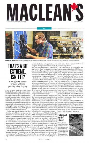
Culture Monster
David Pagel, Los Angeles Times
Culture Monster
All the Arts, All the Time
Art review: Kim Dorland at Mark Moore Gallery
L. A. Times, March 26, 2010 | 9:00 pm
Throughout the 20th century, artists often tried to make paintings that looked as if little kids did them. They wanted to capture the unself-conscious innocence of children and the wonderful way they see things.
The 21st century is shaping up to be the age of adolescence. Artists seem to have pretty much given up on the wide-eyed joys childhood in favor of the hormone-laced mood swings of teens.
At Mark Moore Gallery, Kim Dorland shows himself to be among the most convincing artists working this increasingly popular territory. Titled "1991," the Toronto-based painter's third solo show in Los Angeles ricochets all over the place. Sometimes Dorland masterfully evokes the bottomless yearnings of youth and the bittersweet pleasures of recollecting its long-lost sentiments. At others, his paintings ring hollow, their keyed-up emotionalism curdling into the cliche; of an old guy getting nostalgic.
Dorland's best works, including the 8-by-18-foot "Eastview Sev #2" and "Brown Tree, Green Tree," bring to mind a ripened rendition of German Expressionism. Think a Gen X version of Georges Seurat's "Sunday Afternoon on the Island of La Grande Jatte" to get a feel for the quiet desperation and heartbreaking vulnerability that pulse through Dorland's mongrel melanges of graffiti, precious metal leaf, stenciled imagery, messy drips and gooey globs of oil and acrylic.
Dorland falters when he abandons the landscape and focuses on figures, particularly those caught up in loaded moments. "Kiss" and "High School Portrait" lose touch with the rights of passage they depict by overdoing the paint-handling and exaggerating its significance.
As a painter, Dorland is better with boredom, malaise and alienation. When he gives distance its due and keeps his works emotionally cool, they give potent form to the impatience and frustration of adolescence, which resonate long into adulthood.
– David Pagel
Interview: Kim Dorland
Beautiful Decay
Beautiful Decay Magazine
June, 2009
Interview: Kim Dorland
Kim Dorland is a Toronto based painter who examines the psychic, nostalgic spaces of his upbringing in Canada through sumptuous impasto layers. At once playfully calling attention to their own physicality, as well as the nostalgia of Dorland’s personal narratives, the paintings are at once visceral and expansive. Beautiful/Decay recently interviewed Kim about his artistic inspirations, painting technique and more. Full interview and images after the jump!
Your use of paint is so tactile and sumptuous, though it sort of plays of the trope of impasto in a fresh way- how did you begin working with the material in this fashion, and what are you attempting to convey with its handling?
Within your portraiture, the faces are obliterated, in an almost violent, grotesque fashion- what do you think about the human image and why do you choose to present it in this fashion?
They look more violent to others than they do to me. I have always intended these portraits to be very old-school in their attempt to resemble the person I am painting - again, most often my wife. I actually consider them to be very loving portraits of her.
My use of impasto has evolved quite naturally. I’ve always used paint quite liberally but a few years ago I started to use thickness in a more deliberate way. I wanted to highlight the fact that what the viewer was looking at was painted - I know that seems like a simplistic goal but I was seeing so much painting that spoke directly to photography - it was rubbing me the wrong way or something. The thickness is one of many approaches I use all highlighting the fact that my paintings are painted. In the super-thick portraits the thickness works differently in that the paint actually becomes a kind of flesh of its own. Paint this thick, in a fleshy tone, seems to have a visceral effect. I consider them representational portraits - they aren’t finished until they represent who I am painting (most often my wife, Lori), so the paint carries a certain psychological weight. In Canada there is a rich history of thick painting, I wanted to speak to that as well.
Many of your works seem to evoke a very Americana, campground lifestyle where automobile, nature, RV, animal and man seem to have odd interactions. Where do you draw your subject matter from?
I am Canadian - but I think my work speaks to Americans as well because we do share so much culturally. I draw my subject from the experiences I have lived through and my impoverished upbringing. I paint trailers and low-income housing because that’s where I grew up. The bush parties and fist fights are from first hand experience. And, while growing up in small-town Alberta (in Western Canada), there would be these weird times when you would be walking somewhere and suddenly be face to face with a moose or deer . It’s just the way things were where I grew up. Whenever I visit family back home I take hundreds of photos to work with. Even though I live in Toronto now my work is very tied to the specific space I grew up in.
I love the paintings of tree stumps with graffiti- are these self invented? Or what’s your thinking behind these images?
These came from seeing nature marked with graffiti and carvings. I also wanted to somehow show a trace of activity in nature or the woods without having to have a figure literally depicted in it.
You were born in Wainwright, Canada- apart from occasional iconic symbols included within your work (like the Canadian flag in “Curtain”) how does your upbringing and place of birth inform your work?
My upbringing in Wainwright, and other towns like Red Deer, Alberta are a crucial element informing the narrative and physical space depicted in my work. I will probably work with that specific space for the rest of my life.
Who are some of your other favorite artists and what elements do you admire about their work?
I have a long list of artists whom I admire - mostly painters. Tom Thomson - who might be every Canadian’s favorite painter - a hero of mine. Guston. Picasso - especially the late works. Dekooning. Frank Auerbach. Lucien Freud. Edvard Munch. I like David Altmedj a lot. Diane Arbus. Baselitz. Anselm Keifer. Daniel Richter. Van Gogh. Alex Coleville. Helmut Newton. Warhol. I think Jeff Wall is amazing. Edward Hopper. Alex Katz. Peter Doig. Karen Kilimnick. I like some of these artists for the tone or mood of their works and some for more formal reasons.
Why do you create artwork?
Because I love making paintings. I love the material, the process, the challenge. Also, I’m unemployable, so I don’t know what else I could do.
What’s the significance of the Northern Lights to you?
There is a lake in Northern Saskatchewan called Waskesiu Lake. My wife, when we first got together when we were teenagers, took me there to her family’s cabin. We used to go down to the beach late at night to look at the stars together and sometimes there would be Northern Lights as well. They are very awe-inspiring to see first hand. Beyond that they remind me of a time before life became adult with art career, mortgage, kids etc. I’m nostalgic for that time in my life. We try to go back as often as we can. My son really likes it there.
What projects are you currently working on?
My wife is going to give birth to our second child any day now so that’s the biggest project at the moment. I’m actually taking a couple of months off of painting to give myself a break - I have had a few years of non-stop shows. I have a show up in New York right now as well as Mantova, Italy. There is a book coming out via my Italian gallery. I’m also leading the Emma Lake Workshop (in Northern Saskatchewan) in July - I’m going to try to conjure the ghosts of Clement Greenberg and Barnett Newman. I’ll start working again in the Fall.
Super! Natural!
Roberta Smith, New York Times
New York Times
Art in Review
By ROBERTA SMITH
Published: June 19, 2009
KIM DORLAND
Super! Natural!
Freight and Volume Gallery
542 West 24th Street, Chelsea
Through Thursday
In the landscapes in Kim Dorland's second New York gallery show, both painting and nature are defiled, but bright, electric color keeps things from getting too ugly. Like many painters today, Mr. Dorland operates in the gap between legible imagery and paint's luscious, even oppressive materiality. His exaggeration of the medium has precedents in the work of artists as diverse as Eugene Leroy, Leon Kossoff and Joe Zucker.
Although smoothness is not absent from these works, paint is mostly slathered on and built up into relieflike surfaces, especially with pine trees. There are sometimes additions of fake fur or butterfly decals.
The human disregard for wilderness is often apparent. ''The Clearing,'' ''RIP Tom Thomson'' and ''Go Home'' all depict groves of birch trees that seem to have been ritually stripped of their branches and carved with skulls and obscenities or pinned with cutout pictures of nude women (or both). Flowers go unmolested, often in the form of lilaclike sprigs rendered in daubs of paint that resemble foam packaging peanuts stuck on the surface.
In ''Super! Natural!'' a lexicon of wild animals gathers warily by a mountain lake, among scattered beer bottles. Perhaps they have come for a photo op, out of some kind of unnatural desperation; maybe their images have been culled from assorted calendars. A fifth large canvas depicts Sasquatch holding a dead gray hare; his own coat is an unnatural slurring of deep red, hot pink and fluorescent orange, which makes him an easy target, if he is not already torn and bleeding.
Like his use of color, Mr. Dorland's paint handling often has a surprising delicacy and control. It offsets the mindless, overwrought machismo that his work both exudes and parodies. ROBERTA SMITH
These aren't the Group of Seven's birch trees
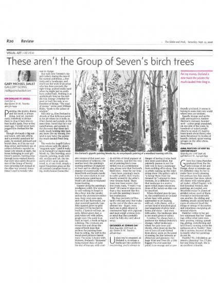
Gary Michael Dault, The Globe & Mail
VISUAL ART: REVIEW
These aren't the Group of Seven's birch trees
GARY MICHAEL DAULT
September 13, 2008
KIM DORLAND AT ANGELL
Painting, like poetry, drama and the novel, is always dying. And yet, mysteriously, somebody is always there to drag it back into robust health again. Four or five years ago, I would never have pegged Kim Dorland for the job.
Though obviously a big natural talent, with lots of brio and a powerful penchant for paint, he seemed awkward and boyish then, as if his eye-scalding colour and feckless use of subjects hitherto regarded as banal (city streets at night, the house belonging to your girlfriend's parents, hunting trips through neon-washed forests that were once safely the province of the Group of Seven) were powering him instead of the other way around. Sometimes I used to wonder who was in charge.
But walk into Toronto's Angell Gallery during the run of his current exhibition, 4 Portraits and a Landscape, and you'll see the work of an artist who has done precisely the right thing: pushed really hard when he might just as easily have pulled back. Nothing is as aesthetically fatal as the middle way. Energy (whether for good or bad) lies only at extremities of things. "The road of excess," wrote poet William Blake, "leads to the palace of wisdom."
Still only 34, Kim Dorland is already at that delicious point in his art where he it looks as if he's bored and ecstatic at the same time: bored that he's not superhuman, and ecstatic in the discovery that there isn't really much holding him back any more (for my money, Dorland is now twice the painter the much-lauded Peter Doig is).
The work the Angell Gallery press release calls the show's "magnum opus" (and it really is) is Dorland's 5½-metre-wide Woods #4. This brawling, encyclopedic painting, made with oils, acrylics and (ah, the impurity of it!) spray paint on wood, is, at one level, simply a super-Panavision gloss on the oft-painted Canadian forest (a big, multichannel home-theatre version of that most conventionalized of subjects). On another level, the painting's teeming embrace of pigmented bush and its offering of all manner of eccentrically rendered birds and beasts stands it in the same relation to normal landscape painting as Noah's ark stands to weekend house-boating.
Saunter along the painting's prodigious width (the work is so vast walking its length is like a foray into the woods) and see the pictorial inventiveness: Keep your eyes open, and you'll spy fluorescent, nuclear-powered squirrels (one little squirrel glows so gold you fancy it'd be too hot to touch), a lipstick-red bear, an eerie, fallout-green deer, a pink-white owl with yellow, googly eyes (the paint is as thick as rope), a moth as big as a dishrag. The creatures are woven into and about the copse of birch trees that anchors the painting from floor to ceiling, the weft to the mural-sized picture's lateral warp. The scene is heavy with blossom, Dorland's "blossoms" being warped discs of paint the size of teacups, with cruddy old bits of dried pigment at their centres. And lest the very act of painting birch trees strikes you as a sentimental one, please note that Dorland's birch trees - trees for our time - have been cunningly made to suffer graffiti, their trunks heavily scored by the artist's own virtuoso hand. These trees now have voices: One tree trunk reads, "I wish I was dead." Of course it takes more than a tiny moment like this to curb the painting's boundless exuberance.
The four portraits (of Dorland's wife and son) that make up the rest of the show are exuberant too - hyper, even. Each one is piled almost 15 centimetres high with pigment and must weigh a tonne (never mind that they probably won't be fully dry until about 2015).