I Heart Paint
-
-
Anne Cottingham, Vancouver is Awesome
Bradley Harms (b. 1971, Winnipeg) uses the language of past painting traditions to address the contemporary cultural experience. Ever mindful of painting’s many histories and -isms, Harms explores both the accord and antagonism between humans and technology. He is at the forefront of Canadian contemporary abstract painting, and has been exhibited widely both within Canada and internationally. Harms earned a BFA from the University of Calgary in 1996 and an MFA from the School of the Art Institute of Chicago in 2004. He recently met with me for drinks, and politely suffered having a recorder in his face for the better part of two hours.
AC: How do you feel about your Black & Yellow show now that it’s closing? It was a very crowded opening.
BH: I loved it, because I never actually had a show in the city. I’ve only been here for just bang-on a year now, and it did exactly what it needed to do. It got people familiar with my work. I’m sure people have been familiar with seeing me at openings, and I’m into discourse and dialogue, but no one ever knew what I did. I wanted to just have a little showcasing of the work, or forum, so people could get in front of these things.
AC:Your current show, ‘Total Confusion Fabulous’, is in conjunction with another show in Toronto…
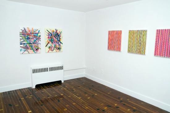
BH: It’s at Angell, the gallery I show with in Toronto. The Vancouver show has seven pieces in it. The one at Angell had twenty-four.
For the Vancouver show, I had the Vancouver Paintings. They’re called The Vancouver Paintings because when I first came here I was just starting to make these text paintings. I found that coming to a city that was steeped in conceptual work and conceptual photography, it gave me the perfect reason to incorporate text of a conceptual nature within the paintings. I find text in work very problematic and troublesome in that meaning is always skewed, and I didn’t want to rely on semantic meaning. So it was the perfect kind of cheeky reason to make a text painting. This city is full of conceptual heavy-weights so I thought, let’s just make a word-play out of their names which also gave me permission to make a text work that I didn’t have to be overly careful with. It was playful right from the get-go.
AC: You must be pretty embroiled in this idea of the Vancouver art scene.
BH: Oh, I’m still confounded by it. I’m still struggling with what it means to make art in this city. Luckily I still have a studio in Calgary that I fly back to. I spend way more time in Vancouver, but every month and a half to two months I go back to Calgary for a couple of weeks to work in the studio there. But yeah, to be in this city, to make work is kind of daunting. The work that I’ve made here has only been shown in very sort of small situations and small increments. Subsequently everything I’ve done here has gone to other galleries in the country.
In terms of a gallery system, this city is pretty closed. That’s what I’m still kind of parsing. In terms of a do-it-yourself position, it’s amazing. That’s what I love about this city. So I came here and I found brothers and sisters in arms, like thieves behind the gates.
AC: People live it.
BH: People do live it. That’s the perfect way to say it. They live the work. The whole commercial aspect of it, I don’t really know yet. We’ll see how it works out. I’m not necessarily even looking for a place to show in this city, because of the other [galleries]. All of my work is going somewhere, so it’s a nice luxury to have, to just be able to be in the city and get a feel for it.
It’s an incredibly complex and multi-layered arts system. You’ve got commercial galleries, you’ve got the artist-run centres, and basically that’s what happens in Calgary. And Vancouver has another aspect that I experienced in Chicago. It’s like the art-soldiers who do the mini shows in their bedroom closets. They’ll do hotel shows. Black & Yellow is a perfect example of it. It shows how this culture has grown to embrace stuff like that.
I’m trying to figure out what I see in Vancouver. I see more energy than finished product, and that’s kind of a weird thing. This is a breeding ground for creativity, but I don’t think it’s yet been realized. That’s why it’s got this do-it-yourself vibe. Everyone is doing something cool but we never really get to see the product, the realization of all the cool shit that people are doing here.
AC: I know that you have a strong following in Calgary. And then I see you’re placing yourself all over the country. It’s not like you’re basing yourself firmly in Vancouver. You’re from Winnipeg originally. You studied in Calgary and then Chicago. You have a gallery representing you in Toronto…
BH: I think this city is great for conceptual heavy-weights but also heavy-weight international people. In having gone to school in the States, everybody at the School of the Art Institute of Chicago knew who Jeff Wall was. Nobody knew he was Canadian. It seems to me that as soon as somebody blows up and becomes international, at least in terms of the way that they’re perceived, they shed their identity as a Canadian artist. And maybe that’s just, ‘well, we’re all artists and there should be no national boundaries to it,’ but I also feel a strong responsibility to show the work here, and show everywhere else as a secondary thing. If the work is good enough it will be international anyway. And if it does travel, I think that we’re responsible for maintaining an identity for our work.
I was just in a show in LA, softcore HARD EDGE. It’s a comparison of hard-edge painting between west-coast LA painters and painters in the region of Calgary, Alberta. It was curated by David Pagel, the critic for the LA Times, and Marianne Elder, who taught at the same school as Pagel. They both noticed this similarity between aesthetics, between abstract hard-edged paints and that kind of west-coast style. People are noticing that there’s an international look to a lot of the work that’s coming out of the west and the west coast, and I think it’s bridging the two of them. Vancouver has never been compared in that way, and I think it will resist being compared in that way. But this city is full of abstract painters. The media just will not let you know it.
AC: Who are some of the names that you’re really excited about here in the city?
BH: Here in the city? I’d have to say Jessica Delorme. Erik Olson was here for the summer, and he’s a spectacular painter. Ben Jacques just had a show at Shudder [with Justin Gradin]. That was pretty incredible. He’s roommates with Justin Patterson. Justin is part of the Arbour Lake Sghool in Calgary. Justin and Ben are also Haunted Beard, an experimental noise band. These are just people that I know from showing up at openings and being there. And Ben Skinner. I went to school with him in Chicago.
AC: Does Chicago focus in on one specific area? Schools are often known for their own preferred movements or styles.
BH: Chicago was completely indebted to the Imagists. That was the heavy-weight school of art-making there. But in having so many good schools very close by, I think Chicago benefited. Like, studio visits with Vanessa Beecroft and Jerry Saltz. This kind of access to art world A-listers was completely enriching, and good in terms of furthering our little student careers, our ideas and connections. I think that that’s where Chicago succeeded as an art school. But as an art center, it is completely do-it-yourself. Michelle Grabner, who was one of my instructors and mentors, she ran a space called The Suburban, because she lived in Oak Park half an hour outside of Chicago. It was in her garage, a six foot by six foot room. She ran this gallery for years, and she had the likes of Luke Tuymans showing work in her space.
So this kind of do-it-yourself, get things done, show interesting things rather than consensus-driven good things was pervasive there. And I kind of feel that in Vancouver. A certain amount of people are going to get shown. That’s not a knock against the system, but it’s a fact that there are so few spaces to show in. I love to see all of these little places popping up, where really incredibly interesting things are happening. It enriches the rest of the community. You can go and see what the well-represented are doing, but then you can go and see what people are thinking about. They’re not necessarily delivering the finished product, but sharing their ideas with one another.
AC: Regarding your work, now. I’m interested in this idea of the sensual nature of your work, of your being ‘the red-headed reactionist’ to Modernism…
BH: When you first mention Modernism, I always feel conflicted about it. I’m definitely building on the Modernist ethos, but I’m also kind of… I don’t want to say tearing it down, but I’m doing the opposite of what the Modernists wanted to do. Modernism concerned itself with purity, with the distillation of ideas. And what I’m concerned with is not distilling something down to it’s essence, but building upon something until it becomes almost blindingly complex, which kind of creates its own minimalism or distillation by that. Instead of the subtractive nature of Modernism, there’s the additive nature of culture as we know it—of speed culture and internet culture and culture of the screen. I take information and I build it up so that it vibrates in the same way that Minimalism vibrates. It is such a glut of information that it is so simple.
My work revels in its ability to show the human hand, whereas digital art making (I call it CTRL-P Painting) doesn’t show that at all. I love tricking the viewer, but I will never fully fool them. If they don’t initially get it, they may think the paintings are digitally produced. And that’s fine if they don’t look far enough. My relationship with the viewer is a fleeting one, and I can only give them as much as they’re willing to take. But if they’re willing to go beyond that and see what’s actually happening in front of their eyes, then it’s super gratifying.
AC: After reading a few reviews referring to how you are reacting against technology, it seemed a little off. If anything you would revel in this idea of limitless opportunity.
BH: I love what technology has made us see. What it has done is allow us to look at our world in a completely different way. We’re a screen culture. We’re a very superficial one, based on interface. A good thing about that is that we are delivered vast amounts of things. The bad thing is that we never actually go beyond that superficial read. That’s where, to my practice, painting and art-making goes way beyond that superficial interface if you let it. If not, if you don’t let it, then you’re just reinforcing what I’m painting about.
AC: You’re not putting yourself in favour of one over the other?
BH: The fact is they exist at the same time and they exist as a commentary about one another, and each of those things can inform and comment on the other one without necessarily having to be better. I’m not going to stop technology. I’m not going to stop the internet. Facebook might. But I’m not going to.
I’m very hesitant to pigeon-hole myself by picking an -ism and sticking to it. That’s why I’m wary of even being associated with Modernism, because my work looks highly Modern, but it’s about something completely different. I think that we need to find something that isn’t related to language, that isn’t related to previous movements, but that is completely related to what we like. Because we’re in a culture where we get what we want and we get what we like. And what has given that to us is technology. We need a movement that is about information and misinformation, because while we get what we like, we don’t always get the truth. And we don’t always need to know the truth. All we need is information. I think about the next -ism as something that is just this build-up, this glut, of information. All of a sudden the pattern starts to make itself apparent, and you can read. You say, “This information actually starts to mean something.” I think that we’re at the point where the glut doesn’t mean anything yet. We’re still parsing it.
AC: So it looks like you’re sticking in this vein for now?
BH: I’m still working on the text paintings. I’m just trying to use ‘fuck’ a lot more.
————-
‘Total Confusion Fabulous’ is showing at Black & Yellow gallery until October 15th. It is on in conjunction with ‘Total Confusion Fabulous’ at Angell Gallery in Toronto, which shows until October 29th. For more information, please visit his website at bradleyharms.com.
All photos courtesy Ruth Skinner and Bradley Harms
Art Condos Blog
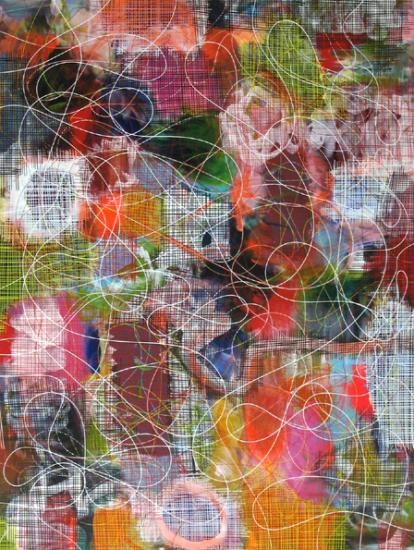
We think this large (77 by 54 inches) acrylic by Winnipeg-born, Vancouver-based painter Bradley Harms is really pretty hot. It’s titled Tabletop DNA.
This airy, open-hearted painting, as absorbing and as intimately inspectable as a game-board, is something of a breakthrough for Harms—who for some time new has been making paintings that are exhaustingly labour-intensive, often involving meticulously painted stripes and other formats requiring huge amounts of precision.
You can see some of these tightly-crafted paintings at The Angell Gallery (on lower Ossington Ave. near Queen Street West) in Harms’s exhibition (which runs until October 29) called Total Confusion Fabulous. You can also see, in the same exhibition (which it dominates), his Tabletop DNA—of which we are so fond.
We always enjoy The Angell Gallery’s zippy press releases. Here is an excerpt from their Bradley Harms notice:
Colors bump and bite each other, getting along and then suddenly seem to argue (but remain friends); and we can tell with a little effort that this is an artist for whom contradictions are strengths, and who feels that nothing is lost by admitting that. Blistering, electrical speed is applied with the slow hand of a classical landscape or portrait painter, and every possible prohibition is violated in the artist’s search to subvert the vocabulary of late Modernism.
Stripes for instance have usually denoted high seriousness and the exclusion of comedy along with imagery; not to mention the use of tape: Harms dispenses with both simultaneously, in a manner whose freshness is undeniable, but also clearly intellectualized, thought through from the start. His choice of color scheme often veers toward the loud and uncompromisingly Op – but at the same time his technical choice to hand draw every line we see, slowing down his process to a proverbial crawl, does something weirdly appealing to this kind of abstraction: it personalizes it.
Although the painting has much else to offer, what we like most about Tabletop DNA is its odd, funny, cheeky, inventive ways of combining, on one painting surface, both tight little configurations (the sharp, twisty chromosome-like spirals—the painterly DNA), and blowsy, wanton passages of pink, wishy-washy blobs, so hitherto foreign to Harms’ work. We feel that the exhibition’s title, Total Confusion Fabulous, gets it just about right.
Tabletop DNA is $9000.00. The Angell Gallery is at 12 Ossington Ave. 416-530-0444. www.angellgallery.com
www.checkoutart.ca
I have always had a hard time with pure abstract art, but Bradley Harms’ work has given me another perspective.
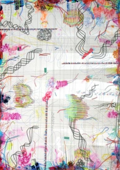
Entitled New Canadian Fiction, Bradley Harms’ latest exhibition at the Angell Gallery (Toronto) continues his exploration of painting as a means of communicating the contemporary experience. This is neither an easy nor straightforward task, especially in our increasingly modern, multi-layered world. Add the word “fiction” and damn! – our understanding of our increasingly multi-layered world just got more complex. After all, nothing like the word “fiction” to undermine the truth of what we experience.
Yet here’s the catch: Perhaps no other word summarizes our world’s rejection of absolutes and rationality quite so well as the word “fiction”. In a society that often appears duplicitous and fragmented, distinguishing between reality and fiction has become our modern day challenge. Technological advances like Photoshop can alter reality with just a few clicks, while You Tube can transform obscurity into overnight sensation and where, exactly, is the reality in the scripted, carefully monitored environment of Reality TV? (Think The Bachelor, the Kardashian’s and that Beverly Hills, 90210 left-over Tori Spelling and her no-name brand hubby).
The blurred distinction between reality and fiction are immediately apparent in Harms’ work. As with his previous work, there is the impression that the vector lines and grids (the mathematic insurers of order and logic) have been digitally executed, but closer inspection reveals the painter’s brush is responsible for what is represented. The lines are imperfect… as are the grids… as are the squiggles… their imperfections serving as a visual reminder that we should question what we see. Moreover, Harms’ lines expand beyond the canvas, as if to suggest that there is more. In the words of Harms, the paintings, like truth and fiction, “expand beyond visibility”.
In his statement, Harms suggests that paintings should have “multiple levels of complexity and simplicity”. Harms’ paintings do, their abstract surfaces of lines, forms, and color refusing to offer one clear answer. Sort of like life and sort of like fiction which always has an underlying truth hidden amidst its subjectivity and embellishments. If it is anything that Harms’ paintings tell us, it is this: Knowledge and truth are never straightforward. They cannot be summarized in one cool phrase or word. They are as contradictory and mutable as our modern experience.
Naomi Carniol, The Toronto Star
After the madness of the holidays, early January tends to be a quiet month on both the gallery and shopping scenes. This week's launch of First Thursdays on West Queen West aims to change that. About 35 of the district's art galleries, shops and restaurants will stay open until 10 p.m. for the new monthly event.
As part of Thursday's festivities, the recently opened Toronto Institute for the Enjoyment of Music (821 Queen St. W.) will present two free musical performances. Over at Camera (1026 Queen), the Stephen Bulger Gallery is hosting a free film screening of The Queen. And women's wear boutique Magpie Designs (884 Queen) will present live music. "In the dreary months of winter, it's nice to have something fun going on," says Magpie co-owner and co-designer Cathy McDayter.
By staying open later, boutique and gallery owners hope to attract not only the after-dinner crowd, but new customers whose schedules prevent them from visiting during regular business hours. Participating stores are offering First Thursdays sales, which shoppers can access by downloading a savings "passport."
While First Thursdays are organized by the local Business Improvement Area, tonight's event isn't just about boosting business.
"It's an invitation to come see our area," says Tao Drayton, owner of vintage clothing shop Cabaret. "It's about a neighbourhood, not just the businesses, but the people, the artists and the community that lives and works down here."
At least two art galleries will host openings Thursday from 6 to 9. Angell Gallery (890 Queen) will unveil work by Calgary-based artist Bradley Harms. Scheduling the opening for First Thursdays lets the gallery "broaden our audience," says owner Jamie Angell.
At Lausberg Contemporary (880 Queen), visitors can meet German artist Jürgen Paas at the opening of his show, "In the Presence of an Original."
For art lovers – and those slightly intimidated by art galleries – arts journalist Betty Ann Jordan will lead an art walk. Kicking off at 6:30 p.m. at the Edward Day Gallery (952 Queen), where artist Doug Guildford will be present, Jordan's tour will visit five galleries and a restaurant (Oddfellows), introduce participants to artists and end with hot chocolate at the Drake Hotel. Complimentary "wine and nibbles" are promised.
The art and design walk is just the beginning, Jordan says. "Our hope is in upcoming months that we will expand the walks to three theme tours. One will be art and design. Another will be music and spoken word and the third will be food and drink."
As for First Thursdays, "it's a work in progress," Jordan says. "It's just going to get better and better."
More info at www.westqueenwest.ca
GARY MICHAEL DAULT, The Globe and Mail: Exhibit A
Bradley Harms agrees that his exacting abstract paintings, such as Yellow, the work illustrated here, owe some of their precision (their apparent precision, anyhow) to his having begun his career as a printmaker. "Printmaking gave me a heightened awareness of the importance of materials and techniques," he says on the phone from his studio in Calgary. "But you always have to be cautious when you use the F-word to talk about painting," he says.
The F-word?
"Craft," Harms says. Ah. Well, he's right of course. Craft is one of those words that seems to elevate mere procedural skill over the intoxication of invention and the presumed rapture of the painterly act.
But for Harms, who has contributed three works (including Yellow) to a small summer group show now at the Angell Gallery, the idea of craft is not constricting.
"Craft," he insists, "is a smarter, tighter way of getting things down."
And what is it, exactly, that Harms gets down? He likes to refer to his kind of painting as "smart abstraction," not out of ego but because, he explains, the term evokes for him a hyper-awareness of what pigment can do and the contexts in which it can do it.
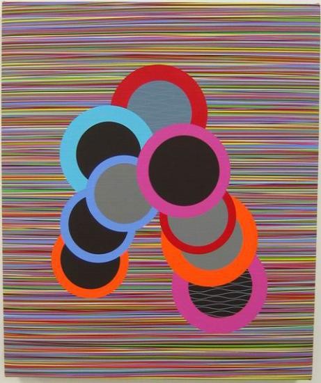
In a typical Harms (and Yellow is typical), there is a dazzling field of thin, multicoloured, horizontal stripes of paint, upon which he has imposed a configuration of bright, interlocked and overlapping discs and circles of paint.
The paintings seem so perfectly realized that you find yourself assuming -- at first glance, anyhow -- that they must be machine-made. It's only when you look at them closely that you notice the little waverings: some variation, for example, in the thickness and density of the stripes, and traces of the adjustments preliminary to the final placement of the discs and circles.
"I try to be perfect," Harms says, "but I'm not ever going to be."
It is, in fact, this inevitable imperfection that lends his paintings a great deal of their meaning. "We are in a digital age," he notes, "and I want to have a dialogue with it." How? "By entering into a kind of visual discussion with the tropes of digital reproduction without having to utilize them."
Exactitude with a human face?
What does this mean in practice? Harms says he sees the thin, precise lines that form the backgrounds to his paintings as "vectorized versions of the pixel." Which is to say, as dots or pixels of colour stretched out and given direction and energy along their paths. This means, according to Harms, that his coloured lines and discs will not simply sit there staring back at you, but will possess "an implied versatility," a constant quickening and pulsing. That's traceable not to programming, but to the degree to which he allows a certain latitude for intuition, for the mysteries, he says, of "touch," for "the humanity of inconsistency" -- all of which adds up to what Harms calls the "alchemy" of a painting. Despite the apparent machine-made aloofness of his finished paintings, each line, each circle or disc of colour, possesses what Harms insists is "its own history on the canvas." Each line or disc is there because of the artist's momentary decision to put it there -- not because of some system he has chosen for generating paintings. "I'm actually a very dedicated painter within the traditional notion of painting," he says, "even though I try constantly to access new ideas."
I accuse him -- genially -- of being romantic. He doesn't flinch as much as I expect. "We live in an age of irony," Harms replies. "And I don't think we're allowed to be non-ironic in our painting any more."
But Harms is non-ironic anyhow. "Paintings have to maintain their interestedness," he says.
Is interestedness actually a word?
"I guess not," he says. "I make up words all the time."
Christopher Willard, Canadian Art Magazine
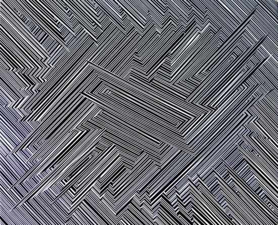
These Days, manipulating a surface with paint, especially when constructing an image with repeating elements, often means inviting the assumption that the work was created digitally. This is especially true of the recent paintings by Bradley Harms in his show “Analog.”
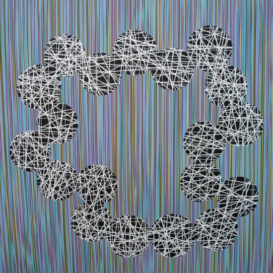
Harms enjoys mimicking the look of digital art; however, he eschews machine techniques. Instead, he hand-applies delicately modulated lines that vary in thickness from the width of a pen line to that of a medium-sized brush. Each line begins at the edge of the stretched canvas, then runs, wobbles, arcs, overlaps and finally dips over the opposite edge. By extending these lines past the surface of the painting and beyond the viewer’s visual awareness, Harms hints they might continue endlessly.
On this striped background he places discs of flat colour in various blues, greens, greys and blacks. When discs sit within larger discs they take on a haloed appearance. Single discs often function as oculi, admitting views into a dark, striped void. Peering through Harms’s artistic microscope, or telescope, reveals only more lines – not the watery-wavy lines of the surface, but lines gathering into systematic networks. It’s a continual dualism, flipping between surface assertion and spatial invitation.
The stylized works can be described as neo-mannerist. Harms has re-evaluated painting in light of the artist’s current freedom from postmodern theory strictures and positioning under the flickering light of digital awareness. The paintings are nearly impossible to look at without considering digital means, and this is exactly what Harms wants: to play upon our expectations. The analog qualities, the variables found in the hand-painted lines, separate the paintings from works actually done with electronic technology. They exemplify a fascinating turn of visual phrase that is a counterpoint to the numerous artists propagating painterly appearances with digital technology.